# Our usual imports
import numpy as np
import pandas as pd
from matplotlib import pyplot as plt

%matplotlib inlineWeek 3A: More Interactive Data Viz
- Section 401
- Sep 18, 2023
Housekeeping
- Homework #1 due on Monday, 9/25
- Homework #2 will be assigned same day
- Choose a dataset to visualize and explore
- OpenDataPhilly or one your choosing
- Email me if you want to analyze one that’s not on OpenDataPhilly
Agenda for Week #3
Two parts:
- Part 1: More interactive data visualization: the HoloViz ecosystem
- Part 2: Getting started with geospatial data analysis in Python
Part 1: More interactive data viz
Recap: The Python data viz landscape
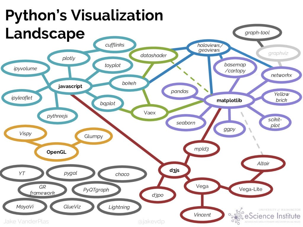
What have we learned so far
Matplotlib
- The classic, most flexible library
- Can handle geographic data well
- Overly verbose syntax, syntax is not declarative
Pandas
- Quick, built-in interface
- Not as many features as other libraries
Seaborn
- Best for visualizing complex relationships between variables
- Improves matplotlib’s syntax: more declarative
Altair
- Easy, declarative syntax
- Lots of interactive features
- Complex visualizations with minimal amounts of code
We’ll learn one more today…
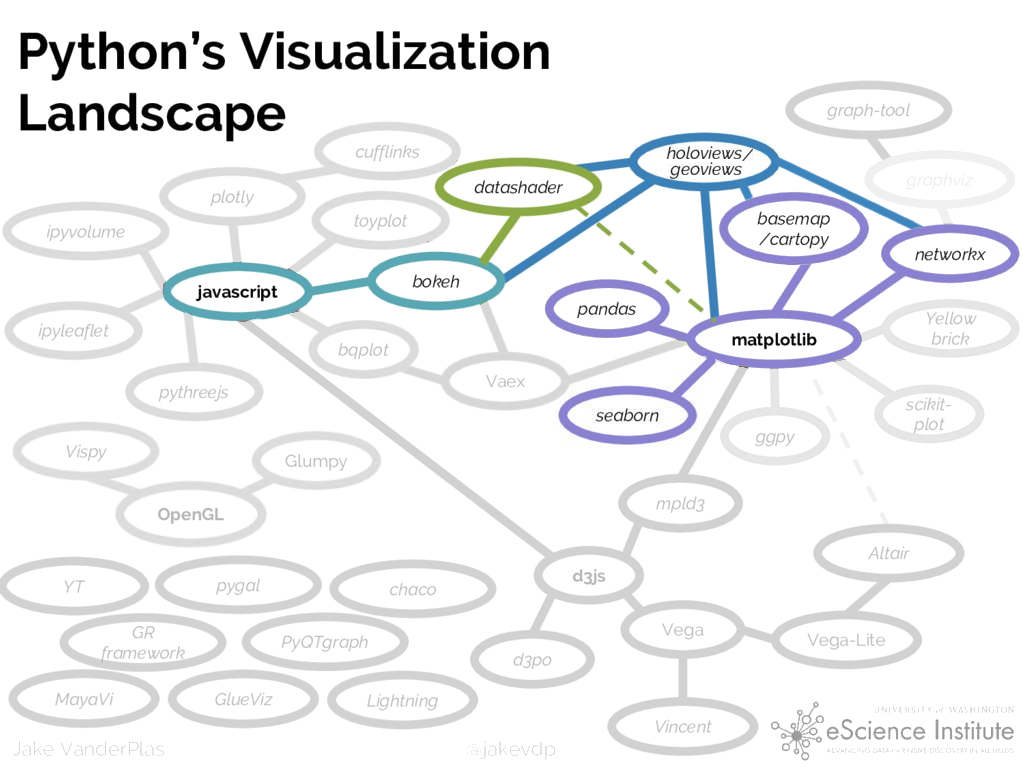
HoloViz: A set of coordinated visualization libraries in Python
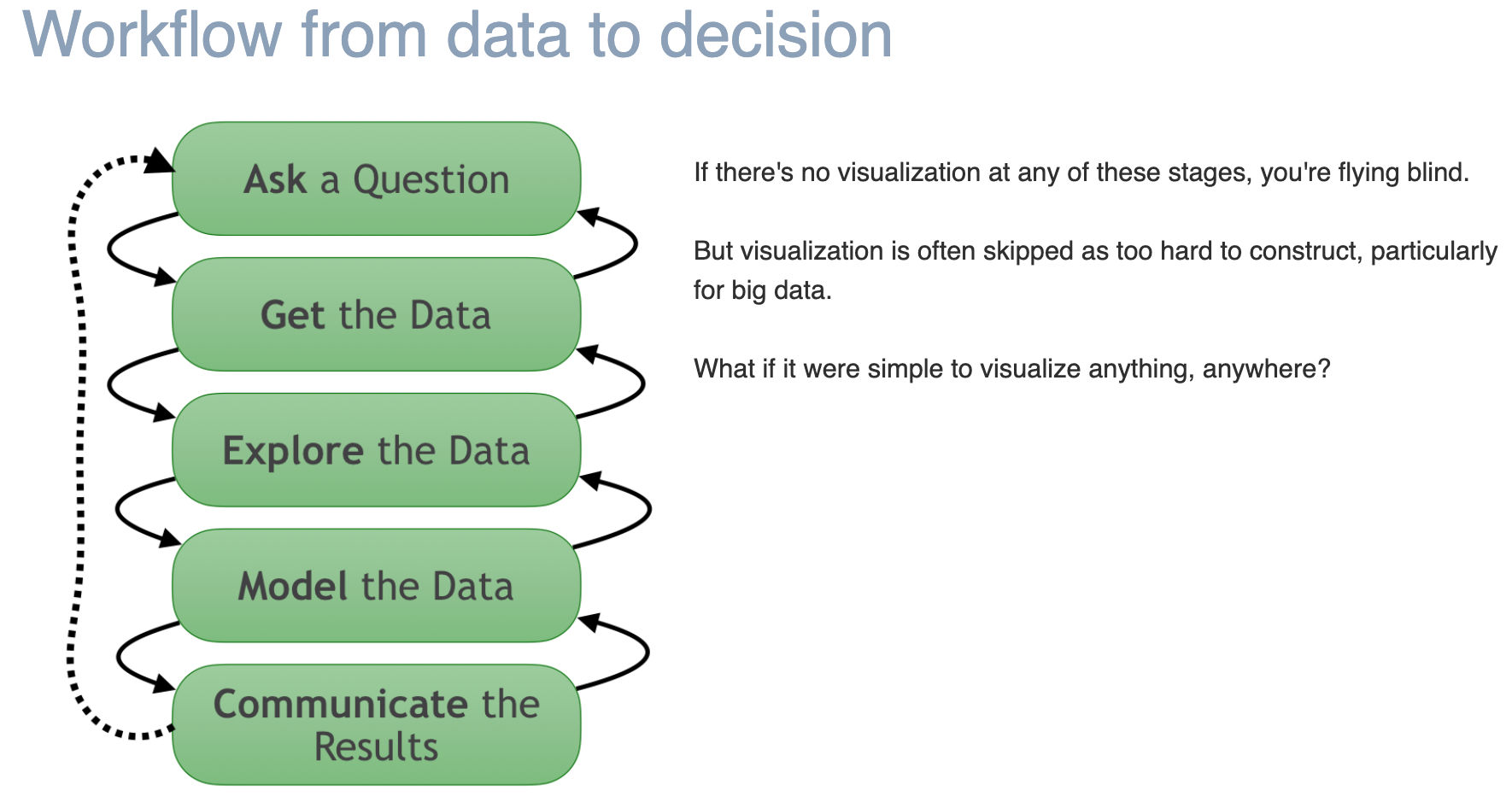
The motivation behind HoloViz mirrors the goals of this course
Proper data visualization is crucial throughout all of the steps of the data science pipeline: data wrangling, modeling, and storytelling
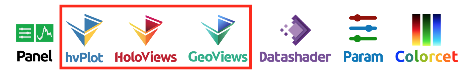
Today: hvPlot, Holoviews, Geoviews
Later in the course: Datashader, Param, Panel
HoloViz: A quick overview
- Bokeh: creating interactive visualizations using Javascript using Python
- HoloViews: a declarative, high-level library for creating bokeh visualizations
Note: The relationship between Bokeh and Holoviews is similar to Altair and Vega
A significant pro
GeoViews builds on HoloViews to add support for geographic data
The major cons
- All are relatively new
- Bokeh is the most well-tested
- HoloViews, GeoViews, hvPlot are being actively developed but are very promising
How does hvPlot fit in?
High-level visualization library designed to help you quickly create interactive charts during your data wrangling
Main uses: - Quickly generate interactive plots from your data - Seamlessly handles pandas and geopandas data - Relies on Holoviews and Geoviews under the hood
It provides an interface just like the pandas plot() function, but much more useful.
Example: let’s return to the measles dataset
# Let's load the measles data from week 2

url = "https://raw.githubusercontent.com/MUSA-550-Fall-2023/week-2/main/data/measles_incidence.csv"
measles_data_raw = pd.read_csv(url, skiprows=2, na_values="-")measles_data_raw.head()| YEAR | WEEK | ALABAMA | ALASKA | ARIZONA | ARKANSAS | CALIFORNIA | COLORADO | CONNECTICUT | DELAWARE | ... | SOUTH DAKOTA | TENNESSEE | TEXAS | UTAH | VERMONT | VIRGINIA | WASHINGTON | WEST VIRGINIA | WISCONSIN | WYOMING | |
|---|---|---|---|---|---|---|---|---|---|---|---|---|---|---|---|---|---|---|---|---|---|
| 0 | 1928 | 1 | 3.67 | NaN | 1.90 | 4.11 | 1.38 | 8.38 | 4.50 | 8.58 | ... | 5.69 | 22.03 | 1.18 | 0.4 | 0.28 | NaN | 14.83 | 3.36 | 1.54 | 0.91 |
| 1 | 1928 | 2 | 6.25 | NaN | 6.40 | 9.91 | 1.80 | 6.02 | 9.00 | 7.30 | ... | 6.57 | 16.96 | 0.63 | NaN | 0.56 | NaN | 17.34 | 4.19 | 0.96 | NaN |
| 2 | 1928 | 3 | 7.95 | NaN | 4.50 | 11.15 | 1.31 | 2.86 | 8.81 | 15.88 | ... | 2.04 | 24.66 | 0.62 | 0.2 | 1.12 | NaN | 15.67 | 4.19 | 4.79 | 1.36 |
| 3 | 1928 | 4 | 12.58 | NaN | 1.90 | 13.75 | 1.87 | 13.71 | 10.40 | 4.29 | ... | 2.19 | 18.86 | 0.37 | 0.2 | 6.70 | NaN | 12.77 | 4.66 | 1.64 | 3.64 |
| 4 | 1928 | 5 | 8.03 | NaN | 0.47 | 20.79 | 2.38 | 5.13 | 16.80 | 5.58 | ... | 3.94 | 20.05 | 1.57 | 0.4 | 6.70 | NaN | 18.83 | 7.37 | 2.91 | 0.91 |
5 rows × 53 columns
Convert from wide to long formats…
measles_data = measles_data_raw.melt(
    id_vars=["YEAR", "WEEK"], value_name="incidence", var_name="state"
)measles_data.head()| YEAR | WEEK | state | incidence | |
|---|---|---|---|---|
| 0 | 1928 | 1 | ALABAMA | 3.67 |
| 1 | 1928 | 2 | ALABAMA | 6.25 |
| 2 | 1928 | 3 | ALABAMA | 7.95 |
| 3 | 1928 | 4 | ALABAMA | 12.58 |
| 4 | 1928 | 5 | ALABAMA | 8.03 |
Reminder: plotting with pandas
The default .plot() doesn’t know which variables to plot.
fig, ax = plt.subplots(figsize=(10, 6))
measles_data.plot(ax=ax)
<Axes: >
But we can group by the year, and plot the national average each year
by_year = measles_data.groupby("YEAR", as_index=False)["incidence"].sum()
by_year.head()| YEAR | incidence | |
|---|---|---|
| 0 | 1928 | 16924.34 |
| 1 | 1929 | 12060.96 |
| 2 | 1930 | 14575.11 |
| 3 | 1931 | 15427.67 |
| 4 | 1932 | 14481.11 |
fig, ax = plt.subplots(figsize=(10, 6))

# Plot the annual average by year
by_year.plot(x='YEAR', y='incidence', ax=ax)

# Add the vaccine year and label
ax.axvline(x=1963, c='k', linewidth=2)
ax.text(1963, 27000, " Vaccine introduced", ha='left', fontsize=18);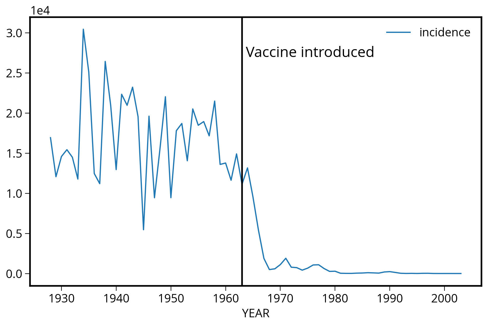
Adding interactivity with hvplot
Use the .hvplot() function to create interactive plots.
# This will add the .hvplot() function to your DataFrame!
# Import holoviews too
import holoviews as hv
import hvplot.pandas

# Load bokeh
hv.extension("bokeh")
img = by_year.hvplot(x='YEAR', y='incidence', kind="line")
imgIn this case, .hvplot() creates a Holoviews Curve object.
Not unlike altair Chart objects, it’s an object that knows how to translate from your DataFrame data to a visualization.
print(img):Curve [YEAR] (incidence)Many different chart types are available…
by_year.hvplot(x="YEAR", y="incidence", kind="scatter")by_year.hvplot(x='YEAR', y='incidence', kind="bar", rot=90, width=1000)Just like in altair, we can also layer chart elements together
Use the * operator to layer together chart elements.
Note: the same thing can be accomplished in altair, but with the + operator.
# The line chart of incidence vs year
incidence = by_year.hvplot(x='YEAR', y='incidence', kind="line")

# Vertical line + label for vaccine year
vline = hv.VLine(1963).opts(color="black")
label = hv.Text(1963, 27000, " Vaccine introduced", halign="left")

final_chart = incidence * vline * label
final_chart
We can group charts by a specific column, with automatic widget selectors
This is some powerful magic.
Let’s calculate the annual measles incidence for each year and state:
by_state = measles_data.groupby(["YEAR", "state"], as_index=False)["incidence"].sum()

by_state.head()| YEAR | state | incidence | |
|---|---|---|---|
| 0 | 1928 | ALABAMA | 334.99 |
| 1 | 1928 | ALASKA | 0.00 |
| 2 | 1928 | ARIZONA | 200.75 |
| 3 | 1928 | ARKANSAS | 481.77 |
| 4 | 1928 | CALIFORNIA | 69.22 |
Now, tell hvplot to plot produce a chart of incidence over time for each state:
by_state_chart = by_state.hvplot(
    x="YEAR", y="incidence", groupby="state", width=400, kind="line"
)

by_state_chart
We can select out individual charts from the set of grouped objects
Use the dict-like selection syntax: [key]
PA = by_state_chart["PENNSYLVANIA"].relabel("PA") # .relabel() is optional — it just changes the title
NJ = by_state_chart["NEW JERSEY"].relabel("NJ")
Combine charts as subplots with the + operator
combined = PA + NJ

combinedprint(combined):Layout
.Curve.PA :Curve [YEAR] (incidence)
.Curve.NJ :Curve [YEAR] (incidence)The charts are side-by-side by default. You can also specify the number of rows/columns explicitly.
# one column
combined.cols(1)
We can also show overlay lines on the same plot
First, select a subset of states we want to highlight using the .isin() function:
states = ["NEW YORK", "NEW JERSEY", "CALIFORNIA", "PENNSYLVANIA"]
sub_states = by_state.loc[ by_state['state'].isin(states) ]sub_states.head(n=10)| YEAR | state | incidence | |
|---|---|---|---|
| 4 | 1928 | CALIFORNIA | 69.22 |
| 30 | 1928 | NEW JERSEY | 797.14 |
| 32 | 1928 | NEW YORK | 649.97 |
| 38 | 1928 | PENNSYLVANIA | 583.95 |
| 55 | 1929 | CALIFORNIA | 72.80 |
| 81 | 1929 | NEW JERSEY | 181.86 |
| 83 | 1929 | NEW YORK | 249.09 |
| 89 | 1929 | PENNSYLVANIA | 489.56 |
| 106 | 1930 | CALIFORNIA | 760.24 |
| 132 | 1930 | NEW JERSEY | 602.87 |
Now, use the by keyword to show multiple plots on the same axes:
sub_state_chart = sub_states.hvplot(
    x="YEAR",  # year on x axis
    y="incidence",  # total incidence on y axis
    by="state",  # NEW: multiple states on same axes
    kind="line",
)

sub_state_chart * vline
We can also show faceted plots
We can explicitly map variables to rows/columns of our visualization. This is similar to the functionality we saw in altair, when we used the alt.Chart().facet(column='state') syntax
Below, we specify the state column should be mapped to each column of the chart:
img = sub_states.reset_index().hvplot(
    x="YEAR",  # year on x axis
    y="incidence",  # total incidence on y axis
    col="state",  # NEW: map the "state" value to each column in the chart
    kind="line",
    rot=90,
    frame_width=200,
)

img * vline
Note
Functions for each kind of chart type are available too. Try tab complete on df.hvplot. to see the options. You can use these functions directly or use pass the kind='chart type' keyword to the .hvplot() function.
# Tab complete
by_state.hvplot.scatter?
Signature: by_state.hvplot.scatter( x=None, y=None, *, alpha, angle, cmap, color, fill_alpha, fill_color, hover_alpha, hover_color, hover_fill_alpha, hover_fill_color, hover_line_alpha, hover_line_cap, hover_line_color, hover_line_dash, hover_line_join, hover_line_width, line_alpha, line_cap, line_color, line_dash, line_join, line_width, marker, muted, muted_alpha, muted_color, muted_fill_alpha, muted_fill_color, muted_line_alpha, muted_line_cap, muted_line_color, muted_line_dash, muted_line_join, muted_line_width, nonselection_alpha, nonselection_color, nonselection_fill_alpha, nonselection_fill_color, nonselection_line_alpha, nonselection_line_cap, nonselection_line_color, nonselection_line_dash, nonselection_line_join, nonselection_line_width, palette, selection_alpha, selection_color, selection_fill_alpha, selection_fill_color, selection_line_alpha, selection_line_cap, selection_line_color, selection_line_dash, selection_line_join, selection_line_width, size, visible, s, c, scale, logz, width, height, shared_axes, grid, legend, rot, xlim, ylim, xticks, yticks, colorbar, invert, title, logx, logy, loglog, xaxis, yaxis, xformatter, yformatter, xlabel, ylabel, clabel, padding, responsive, max_height, max_width, min_height, min_width, frame_height, frame_width, aspect, data_aspect, fontscale, datashade, rasterize, x_sampling, y_sampling, aggregator, **kwargs, ) Docstring: The `scatter` plot visualizes your points as markers in 2D space. You can visualize one more dimension by using colors. The `scatter` plot is a good first way to plot data with non continuous axes. Reference: https://hvplot.holoviz.org/reference/pandas/scatter.html Parameters ---------- x : string, optional Field name(s) to draw x-positions from. If not specified, the index is used. Can refer to continous and categorical data. y : string or list, optional Field name(s) to draw y-positions from. If not specified, all numerical fields are used. marker : string, optional The marker shape specified above can be any supported by matplotlib, e.g. s, d, o etc. See https://matplotlib.org/stable/api/markers_api.html. c : string, optional A color or a Field name to draw the color of the marker from s : int, optional, also available as 'size' The size of the marker by : string, optional A single field or list of fields to group by. All the subgroups are visualized. groupby: string, list, optional A single field or list of fields to group and filter by. Adds one or more widgets to select the subgroup(s) to visualize. scale: number, optional Scaling factor to apply to point scaling. logz : bool Whether to apply log scaling to the z-axis. Default is False. color : str or array-like, optional. The color for each of the series. Possible values are: A single color string referred to by name, RGB or RGBA code, for instance 'red' or '#a98d19. A sequence of color strings referred to by name, RGB or RGBA code, which will be used for each series recursively. For instance ['green','yellow'] each field’s line will be filled in green or yellow, alternatively. If there is only a single series to be plotted, then only the first color from the color list will be used. **kwds : optional Additional keywords arguments are documented in `hvplot.help('scatter')`. Returns ------- A Holoviews object. You can `print` the object to study its composition and run .. code-block:: import holoviews as hv hv.help(the_holoviews_object) to learn more about its parameters and options. Example ------- .. code-block:: import hvplot.pandas import pandas as pd df = pd.DataFrame( { "actual": [100, 150, 125, 140, 145, 135, 123], "forecast": [90, 160, 125, 150, 141, 141, 120], "numerical": [1.1, 1.9, 3.2, 3.8, 4.3, 5.0, 5.5], "date": pd.date_range("2022-01-03", "2022-01-09"), "string": ["Mon", "Tue", "Wed", "Thu", "Fri", "Sat", "Sun"], }, ) scatter = df.hvplot.scatter( x="numerical", y=["actual", "forecast"], ylabel="value", legend="bottom", height=500, color=["#f16a6f", "#1e85f7"], size=100, ) scatter You can overlay the `scatter` markers on for example a `line` plot .. code-block:: line = df.hvplot.line( x="numerical", y=["actual", "forecast"], color=["#f16a6f", "#1e85f7"], line_width=5 ) scatter * line References ---------- - Bokeh: https://docs.bokeh.org/en/latest/docs/user_guide/plotting.html#scatter-markers - HoloViews: https://holoviews.org/reference/elements/matplotlib/Scatter.html - Pandas: https://pandas.pydata.org/docs/reference/api/pandas.DataFrame.plot.scatter.html - Plotly: https://plotly.com/python/line-and-scatter/ - Matplotlib: https://matplotlib.org/stable/api/_as_gen/matplotlib.pyplot.scatter.html - Seaborn: https://seaborn.pydata.org/generated/seaborn.scatterplot.html - Wiki: https://en.wikipedia.org/wiki/Scatter_plot Generic options --------------- clim: tuple Lower and upper bound of the color scale cnorm (default='linear'): str Color scaling which must be one of 'linear', 'log' or 'eq_hist' colorbar (default=False): boolean Enables a colorbar fontscale: number Scales the size of all fonts by the same amount, e.g. fontscale=1.5 enlarges all fonts (title, xticks, labels etc.) by 50% fontsize: number or dict Set title, label and legend text to the same fontsize. Finer control by using a dict: {'title': '15pt', 'ylabel': '5px', 'ticks': 20} flip_xaxis/flip_yaxis: boolean Whether to flip the axis left to right or up and down respectively grid (default=False): boolean Whether to show a grid hover : boolean Whether to show hover tooltips, default is True unless datashade is True in which case hover is False by default hover_cols (default=[]): list or str Additional columns to add to the hover tool or 'all' which will includes all columns (including indexes if use_index is True). invert (default=False): boolean Swaps x- and y-axis frame_width/frame_height: int The width and height of the data area of the plot legend (default=True): boolean or str Whether to show a legend, or a legend position ('top', 'bottom', 'left', 'right') logx/logy (default=False): boolean Enables logarithmic x- and y-axis respectively logz (default=False): boolean Enables logarithmic colormapping loglog (default=False): boolean Enables logarithmic x- and y-axis max_width/max_height: int The maximum width and height of the plot for responsive modes min_width/min_height: int The minimum width and height of the plot for responsive modes padding: number or tuple Fraction by which to increase auto-ranged extents to make datapoints more visible around borders. Supports tuples to specify different amount of padding for x- and y-axis and tuples of tuples to specify different amounts of padding for upper and lower bounds. rescale_discrete_levels (default=True): boolean If `cnorm='eq_hist'` and there are only a few discrete values, then `rescale_discrete_levels=True` (the default) decreases the lower limit of the autoranged span so that the values are rendering towards the (more visible) top of the `cmap` range, thus avoiding washout of the lower values. Has no effect if `cnorm!=`eq_hist`. responsive: boolean Whether the plot should responsively resize depending on the size of the browser. Responsive mode will only work if at least one dimension of the plot is left undefined, e.g. when width and height or width and aspect are set the plot is set to a fixed size, ignoring any responsive option. rot: number Rotates the axis ticks along the x-axis by the specified number of degrees. shared_axes (default=True): boolean Whether to link axes between plots transforms (default={}): dict A dictionary of HoloViews dim transforms to apply before plotting title (default=''): str Title for the plot tools (default=[]): list List of tool instances or strings (e.g. ['tap', 'box_select']) xaxis/yaxis: str or None Whether to show the x/y-axis and whether to place it at the 'top'/'bottom' and 'left'/'right' respectively. xformatter/yformatter (default=None): str or TickFormatter Formatter for the x-axis and y-axis (accepts printf formatter, e.g. '%.3f', and bokeh TickFormatter) xlabel/ylabel/clabel (default=None): str Axis labels for the x-axis, y-axis, and colorbar xlim/ylim (default=None): tuple or list Plot limits of the x- and y-axis xticks/yticks (default=None): int or list Ticks along x- and y-axis specified as an integer, list of ticks positions, or list of tuples of the tick positions and labels width (default=700)/height (default=300): int The width and height of the plot in pixels attr_labels (default=None): bool Whether to use an xarray object's attributes as labels, defaults to None to allow best effort without throwing a warning. Set to True to see warning if the attrs can't be found, set to False to disable the behavior. sort_date (default=True): bool Whether to sort the x-axis by date before plotting symmetric (default=None): bool Whether the data are symmetric around zero. If left unset, the data will be checked for symmetry as long as the size is less than ``check_symmetric_max``. check_symmetric_max (default=1000000): Size above which to stop checking for symmetry by default on the data. Datashader options ------------------ aggregator (default=None): Aggregator to use when applying rasterize or datashade operation (valid options include 'mean', 'count', 'min', 'max' and more, and datashader reduction objects) dynamic (default=True): Whether to return a dynamic plot which sends updates on widget and zoom/pan events or whether all the data should be embedded (warning: for large groupby operations embedded data can become very large if dynamic=False) datashade (default=False): Whether to apply rasterization and shading (colormapping) using the Datashader library, returning an RGB object instead of individual points dynspread (default=False): For plots generated with datashade=True or rasterize=True, automatically increase the point size when the data is sparse so that individual points become more visible rasterize (default=False): Whether to apply rasterization using the Datashader library, returning an aggregated Image (to be colormapped by the plotting backend) instead of individual points x_sampling/y_sampling (default=None): Specifies the smallest allowed sampling interval along the x/y axis. Geographic options ------------------ coastline (default=False): Whether to display a coastline on top of the plot, setting coastline='10m'/'50m'/'110m' specifies a specific scale. crs (default=None): Coordinate reference system of the data specified as Cartopy CRS object, proj.4 string or EPSG code. features (default=None): dict or list A list of features or a dictionary of features and the scale at which to render it. Available features include 'borders', 'coastline', 'lakes', 'land', 'ocean', 'rivers' and 'states'. Available scales include '10m'/'50m'/'110m'. geo (default=False): Whether the plot should be treated as geographic (and assume PlateCarree, i.e. lat/lon coordinates). global_extent (default=False): Whether to expand the plot extent to span the whole globe. project (default=False): Whether to project the data before plotting (adds initial overhead but avoids projecting data when plot is dynamically updated). projection (default=None): str or Cartopy CRS Coordinate reference system of the plot specified as Cartopy CRS object or class name. tiles (default=False): Whether to overlay the plot on a tile source. Tiles sources can be selected by name or a tiles object or class can be passed, the default is 'Wikipedia'. Style options ------------- alpha angle cmap color fill_alpha fill_color hover_alpha hover_color hover_fill_alpha hover_fill_color hover_line_alpha hover_line_cap hover_line_color hover_line_dash hover_line_join hover_line_width line_alpha line_cap line_color line_dash line_join line_width marker muted muted_alpha muted_color muted_fill_alpha muted_fill_color muted_line_alpha muted_line_cap muted_line_color muted_line_dash muted_line_join muted_line_width nonselection_alpha nonselection_color nonselection_fill_alpha nonselection_fill_color nonselection_line_alpha nonselection_line_cap nonselection_line_color nonselection_line_dash nonselection_line_join nonselection_line_width palette selection_alpha selection_color selection_fill_alpha selection_fill_color selection_line_alpha selection_line_cap selection_line_color selection_line_dash selection_line_join selection_line_width size visible File: ~/mambaforge/envs/musa-550-fall-2023/lib/python3.10/site-packages/hvplot/plotting/core.py Type: method
For example, we could plot a bar chart for these four states
Let’s select a subset by both year and state:
# Two selections
sel_year = by_state["YEAR"].isin(range(1960, 1970))
sel_state = by_state["state"].isin(states)

# Use the boolean AND operator: &
sel = sel_year & sel_state

# Grouped bar chart for the desired states and years
by_state.loc[sel].hvplot.bar(x="YEAR", y="incidence", by="state", rot=90)
Change bar() to line() and we get the same thing as before.
by_state.loc[sel].hvplot.line(x="YEAR", y="incidence", by="state", rot=90)Customizing charts
See the help message for explicit hvplot functions:
by_state.hvplot.line?Signature: by_state.hvplot.line( x=None, y=None, *, alpha, color, hover_alpha, hover_color, hover_line_alpha, hover_line_cap, hover_line_color, hover_line_dash, hover_line_join, hover_line_width, line_alpha, line_cap, line_color, line_dash, line_join, line_width, muted, muted_alpha, muted_color, muted_line_alpha, muted_line_cap, muted_line_color, muted_line_dash, muted_line_join, muted_line_width, nonselection_alpha, nonselection_color, nonselection_line_alpha, nonselection_line_cap, nonselection_line_color, nonselection_line_dash, nonselection_line_join, nonselection_line_width, selection_alpha, selection_color, selection_line_alpha, selection_line_cap, selection_line_color, selection_line_dash, selection_line_join, selection_line_width, visible, width, height, shared_axes, grid, legend, rot, xlim, ylim, xticks, yticks, colorbar, invert, title, logx, logy, loglog, xaxis, yaxis, xformatter, yformatter, xlabel, ylabel, clabel, padding, responsive, max_height, max_width, min_height, min_width, frame_height, frame_width, aspect, data_aspect, fontscale, datashade, rasterize, x_sampling, y_sampling, aggregator, **kwargs, ) Docstring: The `line` plot connects the points with a continous curve. Reference: https://hvplot.holoviz.org/reference/pandas/line.html Parameters ---------- x : string, optional Field name(s) to draw x-positions from. If not specified, the index is used. Can refer to continous and categorical data. y : string or list, optional Field name(s) to draw y-positions from. If not specified, all numerical fields are used. by : string, optional A single column or list of columns to group by. All the subgroups are visualized. groupby: string, list, optional A single field or list of fields to group and filter by. Adds one or more widgets to select the subgroup(s) to visualize. color : str or array-like, optional. The color for each of the series. Possible values are: A single color string referred to by name, RGB or RGBA code, for instance 'red' or '#a98d19. A sequence of color strings referred to by name, RGB or RGBA code, which will be used for each series recursively. For instance ['green','yellow'] each field’s line will be filled in green or yellow, alternatively. If there is only a single series to be plotted, then only the first color from the color list will be used. **kwds : optional Additional keywords arguments are documented in `hvplot.help('line')`. Returns ------- A Holoviews object. You can `print` the object to study its composition and run .. code-block:: import holoviews as hv hv.help(the_holoviews_object) to learn more about its parameters and options. Examples -------- .. code-block:: import hvplot.pandas import pandas as pd df = pd.DataFrame( { "actual": [100, 150, 125, 140, 145, 135, 123], "forecast": [90, 160, 125, 150, 141, 141, 120], "numerical": [1.1, 1.9, 3.2, 3.8, 4.3, 5.0, 5.5], "date": pd.date_range("2022-01-03", "2022-01-09"), "string": ["Mon", "Tue", "Wed", "Thu", "Fri", "Sat", "Sun"], }, ) line = df.hvplot.line( x="numerical", y=["actual", "forecast"], ylabel="value", legend="bottom", height=500, color=["steelblue", "teal"], alpha=0.7, line_width=5, ) line You can can add *markers* to a `line` plot by overlaying with a `scatter` plot. .. code-block:: markers = df.hvplot.scatter( x="numerical", y=["actual", "forecast"], color=["steelblue", "teal"], size=50 ) line * markers Please note that you can pass widgets or reactive functions as arguments instead of literal values, c.f. https://hvplot.holoviz.org/user_guide/Widgets.html. References ---------- - Bokeh: https://docs.bokeh.org/en/latest/docs/reference/models/glyphs/line.html - HoloViews: https://holoviews.org/reference/elements/bokeh/Curve.html - Pandas: https://pandas.pydata.org/docs/reference/api/pandas.DataFrame.plot.line.html - Plotly: https://plotly.com/python/line-charts/ - Matplotlib: https://matplotlib.org/stable/api/_as_gen/matplotlib.pyplot.plot.html - Seaborn: https://seaborn.pydata.org/generated/seaborn.lineplot.html - Wiki: https://en.wikipedia.org/wiki/Line_chart Generic options --------------- clim: tuple Lower and upper bound of the color scale cnorm (default='linear'): str Color scaling which must be one of 'linear', 'log' or 'eq_hist' colorbar (default=False): boolean Enables a colorbar fontscale: number Scales the size of all fonts by the same amount, e.g. fontscale=1.5 enlarges all fonts (title, xticks, labels etc.) by 50% fontsize: number or dict Set title, label and legend text to the same fontsize. Finer control by using a dict: {'title': '15pt', 'ylabel': '5px', 'ticks': 20} flip_xaxis/flip_yaxis: boolean Whether to flip the axis left to right or up and down respectively grid (default=False): boolean Whether to show a grid hover : boolean Whether to show hover tooltips, default is True unless datashade is True in which case hover is False by default hover_cols (default=[]): list or str Additional columns to add to the hover tool or 'all' which will includes all columns (including indexes if use_index is True). invert (default=False): boolean Swaps x- and y-axis frame_width/frame_height: int The width and height of the data area of the plot legend (default=True): boolean or str Whether to show a legend, or a legend position ('top', 'bottom', 'left', 'right') logx/logy (default=False): boolean Enables logarithmic x- and y-axis respectively logz (default=False): boolean Enables logarithmic colormapping loglog (default=False): boolean Enables logarithmic x- and y-axis max_width/max_height: int The maximum width and height of the plot for responsive modes min_width/min_height: int The minimum width and height of the plot for responsive modes padding: number or tuple Fraction by which to increase auto-ranged extents to make datapoints more visible around borders. Supports tuples to specify different amount of padding for x- and y-axis and tuples of tuples to specify different amounts of padding for upper and lower bounds. rescale_discrete_levels (default=True): boolean If `cnorm='eq_hist'` and there are only a few discrete values, then `rescale_discrete_levels=True` (the default) decreases the lower limit of the autoranged span so that the values are rendering towards the (more visible) top of the `cmap` range, thus avoiding washout of the lower values. Has no effect if `cnorm!=`eq_hist`. responsive: boolean Whether the plot should responsively resize depending on the size of the browser. Responsive mode will only work if at least one dimension of the plot is left undefined, e.g. when width and height or width and aspect are set the plot is set to a fixed size, ignoring any responsive option. rot: number Rotates the axis ticks along the x-axis by the specified number of degrees. shared_axes (default=True): boolean Whether to link axes between plots transforms (default={}): dict A dictionary of HoloViews dim transforms to apply before plotting title (default=''): str Title for the plot tools (default=[]): list List of tool instances or strings (e.g. ['tap', 'box_select']) xaxis/yaxis: str or None Whether to show the x/y-axis and whether to place it at the 'top'/'bottom' and 'left'/'right' respectively. xformatter/yformatter (default=None): str or TickFormatter Formatter for the x-axis and y-axis (accepts printf formatter, e.g. '%.3f', and bokeh TickFormatter) xlabel/ylabel/clabel (default=None): str Axis labels for the x-axis, y-axis, and colorbar xlim/ylim (default=None): tuple or list Plot limits of the x- and y-axis xticks/yticks (default=None): int or list Ticks along x- and y-axis specified as an integer, list of ticks positions, or list of tuples of the tick positions and labels width (default=700)/height (default=300): int The width and height of the plot in pixels attr_labels (default=None): bool Whether to use an xarray object's attributes as labels, defaults to None to allow best effort without throwing a warning. Set to True to see warning if the attrs can't be found, set to False to disable the behavior. sort_date (default=True): bool Whether to sort the x-axis by date before plotting symmetric (default=None): bool Whether the data are symmetric around zero. If left unset, the data will be checked for symmetry as long as the size is less than ``check_symmetric_max``. check_symmetric_max (default=1000000): Size above which to stop checking for symmetry by default on the data. Datashader options ------------------ aggregator (default=None): Aggregator to use when applying rasterize or datashade operation (valid options include 'mean', 'count', 'min', 'max' and more, and datashader reduction objects) dynamic (default=True): Whether to return a dynamic plot which sends updates on widget and zoom/pan events or whether all the data should be embedded (warning: for large groupby operations embedded data can become very large if dynamic=False) datashade (default=False): Whether to apply rasterization and shading (colormapping) using the Datashader library, returning an RGB object instead of individual points dynspread (default=False): For plots generated with datashade=True or rasterize=True, automatically increase the point size when the data is sparse so that individual points become more visible rasterize (default=False): Whether to apply rasterization using the Datashader library, returning an aggregated Image (to be colormapped by the plotting backend) instead of individual points x_sampling/y_sampling (default=None): Specifies the smallest allowed sampling interval along the x/y axis. Geographic options ------------------ coastline (default=False): Whether to display a coastline on top of the plot, setting coastline='10m'/'50m'/'110m' specifies a specific scale. crs (default=None): Coordinate reference system of the data specified as Cartopy CRS object, proj.4 string or EPSG code. features (default=None): dict or list A list of features or a dictionary of features and the scale at which to render it. Available features include 'borders', 'coastline', 'lakes', 'land', 'ocean', 'rivers' and 'states'. Available scales include '10m'/'50m'/'110m'. geo (default=False): Whether the plot should be treated as geographic (and assume PlateCarree, i.e. lat/lon coordinates). global_extent (default=False): Whether to expand the plot extent to span the whole globe. project (default=False): Whether to project the data before plotting (adds initial overhead but avoids projecting data when plot is dynamically updated). projection (default=None): str or Cartopy CRS Coordinate reference system of the plot specified as Cartopy CRS object or class name. tiles (default=False): Whether to overlay the plot on a tile source. Tiles sources can be selected by name or a tiles object or class can be passed, the default is 'Wikipedia'. Style options ------------- alpha color hover_alpha hover_color hover_line_alpha hover_line_cap hover_line_color hover_line_dash hover_line_join hover_line_width line_alpha line_cap line_color line_dash line_join line_width muted muted_alpha muted_color muted_line_alpha muted_line_cap muted_line_color muted_line_dash muted_line_join muted_line_width nonselection_alpha nonselection_color nonselection_line_alpha nonselection_line_cap nonselection_line_color nonselection_line_dash nonselection_line_join nonselection_line_width selection_alpha selection_color selection_line_alpha selection_line_cap selection_line_color selection_line_dash selection_line_join selection_line_width visible File: ~/mambaforge/envs/musa-550-fall-2023/lib/python3.10/site-packages/hvplot/plotting/core.py Type: method
Can we reproduce the WSJ measles heatmap?
Last week, we reproduced the WSJ measles heatmap using altair….can we do it with hvplot too?
Take a look at the help function for the .hvplot.heatmap() function:
measles_data.hvplot.heatmap?Signature: measles_data.hvplot.heatmap( x=None, y=None, C=None, colorbar=True, *, alpha, annular_alpha, annular_color, annular_fill_alpha, annular_fill_color, annular_hover_alpha, annular_hover_color, annular_hover_fill_alpha, annular_hover_fill_color, annular_hover_line_alpha, annular_hover_line_cap, annular_hover_line_color, annular_hover_line_dash, annular_hover_line_join, annular_hover_line_width, annular_line_alpha, annular_line_cap, annular_line_color, annular_line_dash, annular_line_join, annular_line_width, annular_muted, annular_muted_alpha, annular_muted_color, annular_muted_fill_alpha, annular_muted_fill_color, annular_muted_line_alpha, annular_muted_line_cap, annular_muted_line_color, annular_muted_line_dash, annular_muted_line_join, annular_muted_line_width, annular_nonselection_alpha, annular_nonselection_color, annular_nonselection_fill_alpha, annular_nonselection_fill_color, annular_nonselection_line_alpha, annular_nonselection_line_cap, annular_nonselection_line_color, annular_nonselection_line_dash, annular_nonselection_line_join, annular_nonselection_line_width, annular_selection_alpha, annular_selection_color, annular_selection_fill_alpha, annular_selection_fill_color, annular_selection_line_alpha, annular_selection_line_cap, annular_selection_line_color, annular_selection_line_dash, annular_selection_line_join, annular_selection_line_width, annular_visible, cmap, color, dilate, fill_alpha, fill_color, hover_alpha, hover_color, hover_fill_alpha, hover_fill_color, hover_line_alpha, hover_line_cap, hover_line_color, hover_line_dash, hover_line_join, hover_line_width, line_alpha, line_cap, line_color, line_dash, line_join, line_width, muted, muted_alpha, muted_color, muted_fill_alpha, muted_fill_color, muted_line_alpha, muted_line_cap, muted_line_color, muted_line_dash, muted_line_join, muted_line_width, nonselection_alpha, nonselection_color, nonselection_fill_alpha, nonselection_fill_color, nonselection_line_alpha, nonselection_line_cap, nonselection_line_color, nonselection_line_dash, nonselection_line_join, nonselection_line_width, selection_alpha, selection_color, selection_fill_alpha, selection_fill_color, selection_line_alpha, selection_line_cap, selection_line_color, selection_line_dash, selection_line_join, selection_line_width, ticks_text_align, ticks_text_alpha, ticks_text_baseline, ticks_text_color, ticks_text_font, ticks_text_font_size, ticks_text_font_style, visible, xmarks_alpha, xmarks_color, xmarks_hover_alpha, xmarks_hover_color, xmarks_hover_line_alpha, xmarks_hover_line_cap, xmarks_hover_line_color, xmarks_hover_line_dash, xmarks_hover_line_join, xmarks_hover_line_width, xmarks_line_alpha, xmarks_line_cap, xmarks_line_color, xmarks_line_dash, xmarks_line_join, xmarks_line_width, xmarks_muted, xmarks_muted_alpha, xmarks_muted_color, xmarks_muted_line_alpha, xmarks_muted_line_cap, xmarks_muted_line_color, xmarks_muted_line_dash, xmarks_muted_line_join, xmarks_muted_line_width, xmarks_nonselection_alpha, xmarks_nonselection_color, xmarks_nonselection_line_alpha, xmarks_nonselection_line_cap, xmarks_nonselection_line_color, xmarks_nonselection_line_dash, xmarks_nonselection_line_join, xmarks_nonselection_line_width, xmarks_selection_alpha, xmarks_selection_color, xmarks_selection_line_alpha, xmarks_selection_line_cap, xmarks_selection_line_color, xmarks_selection_line_dash, xmarks_selection_line_join, xmarks_selection_line_width, xmarks_visible, ymarks_alpha, ymarks_color, ymarks_hover_alpha, ymarks_hover_color, ymarks_hover_line_alpha, ymarks_hover_line_cap, ymarks_hover_line_color, ymarks_hover_line_dash, ymarks_hover_line_join, ymarks_hover_line_width, ymarks_line_alpha, ymarks_line_cap, ymarks_line_color, ymarks_line_dash, ymarks_line_join, ymarks_line_width, ymarks_muted, ymarks_muted_alpha, ymarks_muted_color, ymarks_muted_line_alpha, ymarks_muted_line_cap, ymarks_muted_line_color, ymarks_muted_line_dash, ymarks_muted_line_join, ymarks_muted_line_width, ymarks_nonselection_alpha, ymarks_nonselection_color, ymarks_nonselection_line_alpha, ymarks_nonselection_line_cap, ymarks_nonselection_line_color, ymarks_nonselection_line_dash, ymarks_nonselection_line_join, ymarks_nonselection_line_width, ymarks_selection_alpha, ymarks_selection_color, ymarks_selection_line_alpha, ymarks_selection_line_cap, ymarks_selection_line_color, ymarks_selection_line_dash, ymarks_selection_line_join, ymarks_selection_line_width, ymarks_visible, reduce_function, logz, width, height, shared_axes, grid, legend, rot, xlim, ylim, xticks, yticks, invert, title, logx, logy, loglog, xaxis, yaxis, xformatter, yformatter, xlabel, ylabel, clabel, padding, responsive, max_height, max_width, min_height, min_width, frame_height, frame_width, aspect, data_aspect, fontscale, datashade, rasterize, x_sampling, y_sampling, aggregator, **kwargs, ) Docstring: `heatmap` visualises tabular data indexed by two key dimensions as a grid of colored values. This allows spotting correlations in multivariate data and provides a high-level overview of how the two variables are plotted. Reference: https://hvplot.holoviz.org/reference/pandas/heatmap.html Parameters ---------- x : string, optional Field name to draw x coordinates from. If not specified, the index is used. Can refer to continous and categorical data. y : string Field name to draw y-positions from. Can refer to continous and categorical data. C : string, optional Field to draw heatmap color from. If not specified a simple count will be used. colorbar: boolean, optional Whether to display a colorbar. Default is True. logz : bool Whether to apply log scaling to the z-axis. Default is False. reduce_function : function, optional Function to compute statistics for heatmap, for example `np.mean`. **kwds : optional Additional keywords arguments are documented in `hvplot.help('heatmap')`. Returns ------- A Holoviews object. You can `print` the object to study its composition and run .. code-block:: import holoviews as hv hv.help(the_holoviews_object) to learn more about its parameters and options. Example ------- .. code-block:: import hvplot.pandas import numpy as np from bokeh.sampledata import sea_surface_temperature as sst df = sst.sea_surface_temperature df.hvplot.heatmap( x="time.month", y="time.day", C="temperature", reduce_function=np.mean, height=500, width=500, colorbar=False, cmap="blues" ) References ---------- - Bokeh: https://docs.bokeh.org/en/latest/docs/gallery/categorical_heatmap.html - HoloViews: https://holoviews.org/reference/elements/bokeh/HeatMap.html - Matplotlib: https://matplotlib.org/stable/gallery/images_contours_and_fields/image_annotated_heatmap.html - Plotly: https://plotly.com/python/heatmaps/ - Wiki: https://en.wikipedia.org/wiki/Heat_map Generic options --------------- clim: tuple Lower and upper bound of the color scale cnorm (default='linear'): str Color scaling which must be one of 'linear', 'log' or 'eq_hist' colorbar (default=False): boolean Enables a colorbar fontscale: number Scales the size of all fonts by the same amount, e.g. fontscale=1.5 enlarges all fonts (title, xticks, labels etc.) by 50% fontsize: number or dict Set title, label and legend text to the same fontsize. Finer control by using a dict: {'title': '15pt', 'ylabel': '5px', 'ticks': 20} flip_xaxis/flip_yaxis: boolean Whether to flip the axis left to right or up and down respectively grid (default=False): boolean Whether to show a grid hover : boolean Whether to show hover tooltips, default is True unless datashade is True in which case hover is False by default hover_cols (default=[]): list or str Additional columns to add to the hover tool or 'all' which will includes all columns (including indexes if use_index is True). invert (default=False): boolean Swaps x- and y-axis frame_width/frame_height: int The width and height of the data area of the plot legend (default=True): boolean or str Whether to show a legend, or a legend position ('top', 'bottom', 'left', 'right') logx/logy (default=False): boolean Enables logarithmic x- and y-axis respectively logz (default=False): boolean Enables logarithmic colormapping loglog (default=False): boolean Enables logarithmic x- and y-axis max_width/max_height: int The maximum width and height of the plot for responsive modes min_width/min_height: int The minimum width and height of the plot for responsive modes padding: number or tuple Fraction by which to increase auto-ranged extents to make datapoints more visible around borders. Supports tuples to specify different amount of padding for x- and y-axis and tuples of tuples to specify different amounts of padding for upper and lower bounds. rescale_discrete_levels (default=True): boolean If `cnorm='eq_hist'` and there are only a few discrete values, then `rescale_discrete_levels=True` (the default) decreases the lower limit of the autoranged span so that the values are rendering towards the (more visible) top of the `cmap` range, thus avoiding washout of the lower values. Has no effect if `cnorm!=`eq_hist`. responsive: boolean Whether the plot should responsively resize depending on the size of the browser. Responsive mode will only work if at least one dimension of the plot is left undefined, e.g. when width and height or width and aspect are set the plot is set to a fixed size, ignoring any responsive option. rot: number Rotates the axis ticks along the x-axis by the specified number of degrees. shared_axes (default=True): boolean Whether to link axes between plots transforms (default={}): dict A dictionary of HoloViews dim transforms to apply before plotting title (default=''): str Title for the plot tools (default=[]): list List of tool instances or strings (e.g. ['tap', 'box_select']) xaxis/yaxis: str or None Whether to show the x/y-axis and whether to place it at the 'top'/'bottom' and 'left'/'right' respectively. xformatter/yformatter (default=None): str or TickFormatter Formatter for the x-axis and y-axis (accepts printf formatter, e.g. '%.3f', and bokeh TickFormatter) xlabel/ylabel/clabel (default=None): str Axis labels for the x-axis, y-axis, and colorbar xlim/ylim (default=None): tuple or list Plot limits of the x- and y-axis xticks/yticks (default=None): int or list Ticks along x- and y-axis specified as an integer, list of ticks positions, or list of tuples of the tick positions and labels width (default=700)/height (default=300): int The width and height of the plot in pixels attr_labels (default=None): bool Whether to use an xarray object's attributes as labels, defaults to None to allow best effort without throwing a warning. Set to True to see warning if the attrs can't be found, set to False to disable the behavior. sort_date (default=True): bool Whether to sort the x-axis by date before plotting symmetric (default=None): bool Whether the data are symmetric around zero. If left unset, the data will be checked for symmetry as long as the size is less than ``check_symmetric_max``. check_symmetric_max (default=1000000): Size above which to stop checking for symmetry by default on the data. Datashader options ------------------ aggregator (default=None): Aggregator to use when applying rasterize or datashade operation (valid options include 'mean', 'count', 'min', 'max' and more, and datashader reduction objects) dynamic (default=True): Whether to return a dynamic plot which sends updates on widget and zoom/pan events or whether all the data should be embedded (warning: for large groupby operations embedded data can become very large if dynamic=False) datashade (default=False): Whether to apply rasterization and shading (colormapping) using the Datashader library, returning an RGB object instead of individual points dynspread (default=False): For plots generated with datashade=True or rasterize=True, automatically increase the point size when the data is sparse so that individual points become more visible rasterize (default=False): Whether to apply rasterization using the Datashader library, returning an aggregated Image (to be colormapped by the plotting backend) instead of individual points x_sampling/y_sampling (default=None): Specifies the smallest allowed sampling interval along the x/y axis. Geographic options ------------------ coastline (default=False): Whether to display a coastline on top of the plot, setting coastline='10m'/'50m'/'110m' specifies a specific scale. crs (default=None): Coordinate reference system of the data specified as Cartopy CRS object, proj.4 string or EPSG code. features (default=None): dict or list A list of features or a dictionary of features and the scale at which to render it. Available features include 'borders', 'coastline', 'lakes', 'land', 'ocean', 'rivers' and 'states'. Available scales include '10m'/'50m'/'110m'. geo (default=False): Whether the plot should be treated as geographic (and assume PlateCarree, i.e. lat/lon coordinates). global_extent (default=False): Whether to expand the plot extent to span the whole globe. project (default=False): Whether to project the data before plotting (adds initial overhead but avoids projecting data when plot is dynamically updated). projection (default=None): str or Cartopy CRS Coordinate reference system of the plot specified as Cartopy CRS object or class name. tiles (default=False): Whether to overlay the plot on a tile source. Tiles sources can be selected by name or a tiles object or class can be passed, the default is 'Wikipedia'. Style options ------------- alpha annular_alpha annular_color annular_fill_alpha annular_fill_color annular_hover_alpha annular_hover_color annular_hover_fill_alpha annular_hover_fill_color annular_hover_line_alpha annular_hover_line_cap annular_hover_line_color annular_hover_line_dash annular_hover_line_join annular_hover_line_width annular_line_alpha annular_line_cap annular_line_color annular_line_dash annular_line_join annular_line_width annular_muted annular_muted_alpha annular_muted_color annular_muted_fill_alpha annular_muted_fill_color annular_muted_line_alpha annular_muted_line_cap annular_muted_line_color annular_muted_line_dash annular_muted_line_join annular_muted_line_width annular_nonselection_alpha annular_nonselection_color annular_nonselection_fill_alpha annular_nonselection_fill_color annular_nonselection_line_alpha annular_nonselection_line_cap annular_nonselection_line_color annular_nonselection_line_dash annular_nonselection_line_join annular_nonselection_line_width annular_selection_alpha annular_selection_color annular_selection_fill_alpha annular_selection_fill_color annular_selection_line_alpha annular_selection_line_cap annular_selection_line_color annular_selection_line_dash annular_selection_line_join annular_selection_line_width annular_visible cmap color dilate fill_alpha fill_color hover_alpha hover_color hover_fill_alpha hover_fill_color hover_line_alpha hover_line_cap hover_line_color hover_line_dash hover_line_join hover_line_width line_alpha line_cap line_color line_dash line_join line_width muted muted_alpha muted_color muted_fill_alpha muted_fill_color muted_line_alpha muted_line_cap muted_line_color muted_line_dash muted_line_join muted_line_width nonselection_alpha nonselection_color nonselection_fill_alpha nonselection_fill_color nonselection_line_alpha nonselection_line_cap nonselection_line_color nonselection_line_dash nonselection_line_join nonselection_line_width selection_alpha selection_color selection_fill_alpha selection_fill_color selection_line_alpha selection_line_cap selection_line_color selection_line_dash selection_line_join selection_line_width ticks_text_align ticks_text_alpha ticks_text_baseline ticks_text_color ticks_text_font ticks_text_font_size ticks_text_font_style visible xmarks_alpha xmarks_color xmarks_hover_alpha xmarks_hover_color xmarks_hover_line_alpha xmarks_hover_line_cap xmarks_hover_line_color xmarks_hover_line_dash xmarks_hover_line_join xmarks_hover_line_width xmarks_line_alpha xmarks_line_cap xmarks_line_color xmarks_line_dash xmarks_line_join xmarks_line_width xmarks_muted xmarks_muted_alpha xmarks_muted_color xmarks_muted_line_alpha xmarks_muted_line_cap xmarks_muted_line_color xmarks_muted_line_dash xmarks_muted_line_join xmarks_muted_line_width xmarks_nonselection_alpha xmarks_nonselection_color xmarks_nonselection_line_alpha xmarks_nonselection_line_cap xmarks_nonselection_line_color xmarks_nonselection_line_dash xmarks_nonselection_line_join xmarks_nonselection_line_width xmarks_selection_alpha xmarks_selection_color xmarks_selection_line_alpha xmarks_selection_line_cap xmarks_selection_line_color xmarks_selection_line_dash xmarks_selection_line_join xmarks_selection_line_width xmarks_visible ymarks_alpha ymarks_color ymarks_hover_alpha ymarks_hover_color ymarks_hover_line_alpha ymarks_hover_line_cap ymarks_hover_line_color ymarks_hover_line_dash ymarks_hover_line_join ymarks_hover_line_width ymarks_line_alpha ymarks_line_cap ymarks_line_color ymarks_line_dash ymarks_line_join ymarks_line_width ymarks_muted ymarks_muted_alpha ymarks_muted_color ymarks_muted_line_alpha ymarks_muted_line_cap ymarks_muted_line_color ymarks_muted_line_dash ymarks_muted_line_join ymarks_muted_line_width ymarks_nonselection_alpha ymarks_nonselection_color ymarks_nonselection_line_alpha ymarks_nonselection_line_cap ymarks_nonselection_line_color ymarks_nonselection_line_dash ymarks_nonselection_line_join ymarks_nonselection_line_width ymarks_selection_alpha ymarks_selection_color ymarks_selection_line_alpha ymarks_selection_line_cap ymarks_selection_line_color ymarks_selection_line_dash ymarks_selection_line_join ymarks_selection_line_width ymarks_visible File: ~/mambaforge/envs/musa-550-fall-2023/lib/python3.10/site-packages/hvplot/plotting/core.py Type: method
Two methods:
We want to plot ‘YEAR’ on the x axis, ‘state’ on the y axis, and specify ‘incidence’ as the values begin plotted in each heatmap bin.
- You can use the
by_statedata frame which has already summed over weeks for each state - Use the original, tidy data (
measles_data) with columns for state, week, year, and incidence- You will need to use the
reduce_functionkeyword to sum over weeks
- You will need to use the
Method #1
Use our aggregated dataframe: by_state
by_state.head()| YEAR | state | incidence | |
|---|---|---|---|
| 0 | 1928 | ALABAMA | 334.99 |
| 1 | 1928 | ALASKA | 0.00 |
| 2 | 1928 | ARIZONA | 200.75 |
| 3 | 1928 | ARKANSAS | 481.77 |
| 4 | 1928 | CALIFORNIA | 69.22 |
# METHOD #1: just plot the incidence
heatmap = by_state.hvplot.heatmap(
    x="YEAR",  # x-axis
    y="state",  # y-axis
    C="incidence",  # color in each heatmap box
    cmap="viridis",  # color map to use
    height=500,
    width=800,
    flip_yaxis=True,
    rot=90,
)

# Turn off tools
heatmap = heatmap.opts(default_tools=[])

# Change the axes labels
heatmap = heatmap.redim(
    state="State",
    YEAR="Year",
)

heatmap
Method #2
Pass in the original data and have hvplot do the aggregation for us, using the reduce_function keyword:
measles_data.head()| YEAR | WEEK | state | incidence | |
|---|---|---|---|---|
| 0 | 1928 | 1 | ALABAMA | 3.67 |
| 1 | 1928 | 2 | ALABAMA | 6.25 |
| 2 | 1928 | 3 | ALABAMA | 7.95 |
| 3 | 1928 | 4 | ALABAMA | 12.58 |
| 4 | 1928 | 5 | ALABAMA | 8.03 |
## METHOD 2: hvplot does the aggregation
heatmap = measles_data.hvplot.heatmap(
    x="YEAR",
    y="state",
    C="incidence",
    cmap="viridis",
    reduce_function=np.sum,  # NEW: Aggregate and sum incidence
    height=500,
    width=800,
    flip_yaxis=True,
    rot=90,
)

# Turn off tools
heatmap = heatmap.opts(default_tools=[])

# Relabel axes
heatmap = heatmap.redim(state="State", YEAR="Year")

heatmap
Just like altair: save the file as html
import hvplot

hvplot.save(heatmap, "measles.html")
# load the html file and display it
from IPython.display import HTML
HTML("measles.html")Two more useful features:
- Scatter matrix plots
- Explorer mode
1. Scatter matrix plots
Visualizing relationships between variables, as we have seen in seaborn and altair
Let’s load the penguins data set from week 2
url = "https://raw.githubusercontent.com/MUSA-550-Fall-2023/week-2/main/data/penguins.csv"
penguins = pd.read_csv(url)penguins.head()| species | island | bill_length_mm | bill_depth_mm | flipper_length_mm | body_mass_g | sex | year | |
|---|---|---|---|---|---|---|---|---|
| 0 | Adelie | Torgersen | 39.1 | 18.7 | 181.0 | 3750.0 | male | 2007 |
| 1 | Adelie | Torgersen | 39.5 | 17.4 | 186.0 | 3800.0 | female | 2007 |
| 2 | Adelie | Torgersen | 40.3 | 18.0 | 195.0 | 3250.0 | female | 2007 |
| 3 | Adelie | Torgersen | NaN | NaN | NaN | NaN | NaN | 2007 |
| 4 | Adelie | Torgersen | 36.7 | 19.3 | 193.0 | 3450.0 | female | 2007 |
Use the hvplot.scatter_matrix() function:
penguins.hvplot.scatter?Signature: penguins.hvplot.scatter( x=None, y=None, *, alpha, angle, cmap, color, fill_alpha, fill_color, hover_alpha, hover_color, hover_fill_alpha, hover_fill_color, hover_line_alpha, hover_line_cap, hover_line_color, hover_line_dash, hover_line_join, hover_line_width, line_alpha, line_cap, line_color, line_dash, line_join, line_width, marker, muted, muted_alpha, muted_color, muted_fill_alpha, muted_fill_color, muted_line_alpha, muted_line_cap, muted_line_color, muted_line_dash, muted_line_join, muted_line_width, nonselection_alpha, nonselection_color, nonselection_fill_alpha, nonselection_fill_color, nonselection_line_alpha, nonselection_line_cap, nonselection_line_color, nonselection_line_dash, nonselection_line_join, nonselection_line_width, palette, selection_alpha, selection_color, selection_fill_alpha, selection_fill_color, selection_line_alpha, selection_line_cap, selection_line_color, selection_line_dash, selection_line_join, selection_line_width, size, visible, s, c, scale, logz, width, height, shared_axes, grid, legend, rot, xlim, ylim, xticks, yticks, colorbar, invert, title, logx, logy, loglog, xaxis, yaxis, xformatter, yformatter, xlabel, ylabel, clabel, padding, responsive, max_height, max_width, min_height, min_width, frame_height, frame_width, aspect, data_aspect, fontscale, datashade, rasterize, x_sampling, y_sampling, aggregator, **kwargs, ) Docstring: The `scatter` plot visualizes your points as markers in 2D space. You can visualize one more dimension by using colors. The `scatter` plot is a good first way to plot data with non continuous axes. Reference: https://hvplot.holoviz.org/reference/pandas/scatter.html Parameters ---------- x : string, optional Field name(s) to draw x-positions from. If not specified, the index is used. Can refer to continous and categorical data. y : string or list, optional Field name(s) to draw y-positions from. If not specified, all numerical fields are used. marker : string, optional The marker shape specified above can be any supported by matplotlib, e.g. s, d, o etc. See https://matplotlib.org/stable/api/markers_api.html. c : string, optional A color or a Field name to draw the color of the marker from s : int, optional, also available as 'size' The size of the marker by : string, optional A single field or list of fields to group by. All the subgroups are visualized. groupby: string, list, optional A single field or list of fields to group and filter by. Adds one or more widgets to select the subgroup(s) to visualize. scale: number, optional Scaling factor to apply to point scaling. logz : bool Whether to apply log scaling to the z-axis. Default is False. color : str or array-like, optional. The color for each of the series. Possible values are: A single color string referred to by name, RGB or RGBA code, for instance 'red' or '#a98d19. A sequence of color strings referred to by name, RGB or RGBA code, which will be used for each series recursively. For instance ['green','yellow'] each field’s line will be filled in green or yellow, alternatively. If there is only a single series to be plotted, then only the first color from the color list will be used. **kwds : optional Additional keywords arguments are documented in `hvplot.help('scatter')`. Returns ------- A Holoviews object. You can `print` the object to study its composition and run .. code-block:: import holoviews as hv hv.help(the_holoviews_object) to learn more about its parameters and options. Example ------- .. code-block:: import hvplot.pandas import pandas as pd df = pd.DataFrame( { "actual": [100, 150, 125, 140, 145, 135, 123], "forecast": [90, 160, 125, 150, 141, 141, 120], "numerical": [1.1, 1.9, 3.2, 3.8, 4.3, 5.0, 5.5], "date": pd.date_range("2022-01-03", "2022-01-09"), "string": ["Mon", "Tue", "Wed", "Thu", "Fri", "Sat", "Sun"], }, ) scatter = df.hvplot.scatter( x="numerical", y=["actual", "forecast"], ylabel="value", legend="bottom", height=500, color=["#f16a6f", "#1e85f7"], size=100, ) scatter You can overlay the `scatter` markers on for example a `line` plot .. code-block:: line = df.hvplot.line( x="numerical", y=["actual", "forecast"], color=["#f16a6f", "#1e85f7"], line_width=5 ) scatter * line References ---------- - Bokeh: https://docs.bokeh.org/en/latest/docs/user_guide/plotting.html#scatter-markers - HoloViews: https://holoviews.org/reference/elements/matplotlib/Scatter.html - Pandas: https://pandas.pydata.org/docs/reference/api/pandas.DataFrame.plot.scatter.html - Plotly: https://plotly.com/python/line-and-scatter/ - Matplotlib: https://matplotlib.org/stable/api/_as_gen/matplotlib.pyplot.scatter.html - Seaborn: https://seaborn.pydata.org/generated/seaborn.scatterplot.html - Wiki: https://en.wikipedia.org/wiki/Scatter_plot Generic options --------------- clim: tuple Lower and upper bound of the color scale cnorm (default='linear'): str Color scaling which must be one of 'linear', 'log' or 'eq_hist' colorbar (default=False): boolean Enables a colorbar fontscale: number Scales the size of all fonts by the same amount, e.g. fontscale=1.5 enlarges all fonts (title, xticks, labels etc.) by 50% fontsize: number or dict Set title, label and legend text to the same fontsize. Finer control by using a dict: {'title': '15pt', 'ylabel': '5px', 'ticks': 20} flip_xaxis/flip_yaxis: boolean Whether to flip the axis left to right or up and down respectively grid (default=False): boolean Whether to show a grid hover : boolean Whether to show hover tooltips, default is True unless datashade is True in which case hover is False by default hover_cols (default=[]): list or str Additional columns to add to the hover tool or 'all' which will includes all columns (including indexes if use_index is True). invert (default=False): boolean Swaps x- and y-axis frame_width/frame_height: int The width and height of the data area of the plot legend (default=True): boolean or str Whether to show a legend, or a legend position ('top', 'bottom', 'left', 'right') logx/logy (default=False): boolean Enables logarithmic x- and y-axis respectively logz (default=False): boolean Enables logarithmic colormapping loglog (default=False): boolean Enables logarithmic x- and y-axis max_width/max_height: int The maximum width and height of the plot for responsive modes min_width/min_height: int The minimum width and height of the plot for responsive modes padding: number or tuple Fraction by which to increase auto-ranged extents to make datapoints more visible around borders. Supports tuples to specify different amount of padding for x- and y-axis and tuples of tuples to specify different amounts of padding for upper and lower bounds. rescale_discrete_levels (default=True): boolean If `cnorm='eq_hist'` and there are only a few discrete values, then `rescale_discrete_levels=True` (the default) decreases the lower limit of the autoranged span so that the values are rendering towards the (more visible) top of the `cmap` range, thus avoiding washout of the lower values. Has no effect if `cnorm!=`eq_hist`. responsive: boolean Whether the plot should responsively resize depending on the size of the browser. Responsive mode will only work if at least one dimension of the plot is left undefined, e.g. when width and height or width and aspect are set the plot is set to a fixed size, ignoring any responsive option. rot: number Rotates the axis ticks along the x-axis by the specified number of degrees. shared_axes (default=True): boolean Whether to link axes between plots transforms (default={}): dict A dictionary of HoloViews dim transforms to apply before plotting title (default=''): str Title for the plot tools (default=[]): list List of tool instances or strings (e.g. ['tap', 'box_select']) xaxis/yaxis: str or None Whether to show the x/y-axis and whether to place it at the 'top'/'bottom' and 'left'/'right' respectively. xformatter/yformatter (default=None): str or TickFormatter Formatter for the x-axis and y-axis (accepts printf formatter, e.g. '%.3f', and bokeh TickFormatter) xlabel/ylabel/clabel (default=None): str Axis labels for the x-axis, y-axis, and colorbar xlim/ylim (default=None): tuple or list Plot limits of the x- and y-axis xticks/yticks (default=None): int or list Ticks along x- and y-axis specified as an integer, list of ticks positions, or list of tuples of the tick positions and labels width (default=700)/height (default=300): int The width and height of the plot in pixels attr_labels (default=None): bool Whether to use an xarray object's attributes as labels, defaults to None to allow best effort without throwing a warning. Set to True to see warning if the attrs can't be found, set to False to disable the behavior. sort_date (default=True): bool Whether to sort the x-axis by date before plotting symmetric (default=None): bool Whether the data are symmetric around zero. If left unset, the data will be checked for symmetry as long as the size is less than ``check_symmetric_max``. check_symmetric_max (default=1000000): Size above which to stop checking for symmetry by default on the data. Datashader options ------------------ aggregator (default=None): Aggregator to use when applying rasterize or datashade operation (valid options include 'mean', 'count', 'min', 'max' and more, and datashader reduction objects) dynamic (default=True): Whether to return a dynamic plot which sends updates on widget and zoom/pan events or whether all the data should be embedded (warning: for large groupby operations embedded data can become very large if dynamic=False) datashade (default=False): Whether to apply rasterization and shading (colormapping) using the Datashader library, returning an RGB object instead of individual points dynspread (default=False): For plots generated with datashade=True or rasterize=True, automatically increase the point size when the data is sparse so that individual points become more visible rasterize (default=False): Whether to apply rasterization using the Datashader library, returning an aggregated Image (to be colormapped by the plotting backend) instead of individual points x_sampling/y_sampling (default=None): Specifies the smallest allowed sampling interval along the x/y axis. Geographic options ------------------ coastline (default=False): Whether to display a coastline on top of the plot, setting coastline='10m'/'50m'/'110m' specifies a specific scale. crs (default=None): Coordinate reference system of the data specified as Cartopy CRS object, proj.4 string or EPSG code. features (default=None): dict or list A list of features or a dictionary of features and the scale at which to render it. Available features include 'borders', 'coastline', 'lakes', 'land', 'ocean', 'rivers' and 'states'. Available scales include '10m'/'50m'/'110m'. geo (default=False): Whether the plot should be treated as geographic (and assume PlateCarree, i.e. lat/lon coordinates). global_extent (default=False): Whether to expand the plot extent to span the whole globe. project (default=False): Whether to project the data before plotting (adds initial overhead but avoids projecting data when plot is dynamically updated). projection (default=None): str or Cartopy CRS Coordinate reference system of the plot specified as Cartopy CRS object or class name. tiles (default=False): Whether to overlay the plot on a tile source. Tiles sources can be selected by name or a tiles object or class can be passed, the default is 'Wikipedia'. Style options ------------- alpha angle cmap color fill_alpha fill_color hover_alpha hover_color hover_fill_alpha hover_fill_color hover_line_alpha hover_line_cap hover_line_color hover_line_dash hover_line_join hover_line_width line_alpha line_cap line_color line_dash line_join line_width marker muted muted_alpha muted_color muted_fill_alpha muted_fill_color muted_line_alpha muted_line_cap muted_line_color muted_line_dash muted_line_join muted_line_width nonselection_alpha nonselection_color nonselection_fill_alpha nonselection_fill_color nonselection_line_alpha nonselection_line_cap nonselection_line_color nonselection_line_dash nonselection_line_join nonselection_line_width palette selection_alpha selection_color selection_fill_alpha selection_fill_color selection_line_alpha selection_line_cap selection_line_color selection_line_dash selection_line_join selection_line_width size visible File: ~/mambaforge/envs/musa-550-fall-2023/lib/python3.10/site-packages/hvplot/plotting/core.py Type: method
columns = ["flipper_length_mm", "bill_length_mm", "body_mass_g", "species"]
hvplot.scatter_matrix(penguins[columns], c="species")
Note the “box select” and “lasso” features on the tool bar for interactions
2. Explorer mode
- An interactive interface that allows you to easily generate customized plots, which makes it easy to explore both your data and hvPlot’s options, parameters, etc.
- New feature just released!
penguins.head()| species | island | bill_length_mm | bill_depth_mm | flipper_length_mm | body_mass_g | sex | year | |
|---|---|---|---|---|---|---|---|---|
| 0 | Adelie | Torgersen | 39.1 | 18.7 | 181.0 | 3750.0 | male | 2007 |
| 1 | Adelie | Torgersen | 39.5 | 17.4 | 186.0 | 3800.0 | female | 2007 |
| 2 | Adelie | Torgersen | 40.3 | 18.0 | 195.0 | 3250.0 | female | 2007 |
| 3 | Adelie | Torgersen | NaN | NaN | NaN | NaN | NaN | 2007 |
| 4 | Adelie | Torgersen | 36.7 | 19.3 | 193.0 | 3450.0 | female | 2007 |
hvexplorer = hvplot.explorer(penguins)
hvexplorer
Get the code for your customized plot!
You can export the current state of the explorer by running hvexplorer.plot_code()
hvexplorer.plot_code()"df.hvplot(x='index')"penguins.hvplot(
by=["species"],
colorbar=True,
kind="scatter",
title="Bill Depth vs. Bill Length by Species",
x="bill_depth_mm",
xlabel="Bill Depth (mm)",
y=["bill_length_mm"],
ylabel="Bill Length (mm)",
)Recap: altair vs hvplot
- Both use a declarative syntax (altair more so than hvplot)
- Users of ggplot might be more familiar with altair’s syntax
- hvplot integrates directly into pandas dataframes via the
.hvplot()function - Both have support for cross-filtering and interactions
- Both can be incorporated into web-based dashboard via HTML (later in course)
- hvplot has better support for large data (later in course)
It’s largely up to you which one you feel is easier to use
Documentation references
- Hvplot user guide
- HoloViz tutorial: introduction to the HoloViz ecosystem
- HoloViews user guide and gallery
Some very cool examples available in the galleries
That’s it!
- We’ll get started with geopandas and geospatial data analysis next time
- See you on Wednesday!