# Let's setup the imports we'll need first
import altair as alt
import geopandas as gpd
import hvplot.pandas
import numpy as np
import pandas as pd
import seaborn as sns
from matplotlib import pyplot as plt

%matplotlib inlineWeek 4A: Geospatial Data Analysis, Continued
- Section 401
- Monday, September 25, 2023
Housekeeping
- Homework #1 due today by the end of the day
- Homework #2 assigned, due in two weeks
- Choose a dataset to visualize and explore
- OpenDataPhilly or one your choosing
- Email me if you want to analyze one that’s not on OpenDataPhilly
Agenda for Week #4
Last lecture - Vector data and introduction to GeoPandas - Spatial relationships - Spatial joins
Today
- Visualization for geospatial data
- Demo: 311 requests by neighborhood in Philadelphia
- Exercise: Property assessments by neighborhood
Example, Continued: Exploring trash-related 311 tickets by neighborhood in 2020
Let’s continuing analyzing data for 311 requests in Philadelphia during the pandemic in 2020. Today, we’ll dive into examining trends by neighborhood.
Find out more…
Trash collection was a big concern in Philadelphia when the pandemic began. Check out this article in the Philadelphia Inquirer for more details!
First, let’s load our data and create our GeoDataFrame.
Note: The below code is copied over from last lecture (lecture 3B).
# Load the data from a CSV file into a pandas DataFrame
trash_requests_df = pd.read_csv(
    "data/trash_311_requests_2020.csv"  # Use the file path relative to the current folder
)

# Remove rows with missing geometry
trash_requests_df = trash_requests_df.dropna(subset=["lat", "lon"])

# Create our GeoDataFrame with geometry column created from lon/lat
trash_requests = gpd.GeoDataFrame(
    trash_requests_df,
    geometry=gpd.points_from_xy(trash_requests_df["lon"], trash_requests_df["lat"]),
    crs="EPSG:4326",
)
Now let’s examine the trends by neighborhoods across the city.
Goal: For each neighborhood, calculate the number of trash-related requests
1. Load Zillow neighborhood data
A GeoJSON holding Zillow definitions for Philadelphia neighborhoods is available in the data/ directory.
zillow = gpd.read_file("data/zillow_neighborhoods.geojson")zillow.head()| ZillowName | geometry | |
|---|---|---|
| 0 | Academy Gardens | POLYGON ((-74.99851 40.06435, -74.99456 40.061... |
| 1 | Airport | POLYGON ((-75.19728 39.89252, -75.19617 39.892... |
| 2 | Allegheny West | POLYGON ((-75.16592 40.00327, -75.16596 40.003... |
| 3 | Andorra | POLYGON ((-75.22463 40.06686, -75.22588 40.065... |
| 4 | Aston Woodbridge | POLYGON ((-75.00860 40.05369, -75.00861 40.053... |
Convert to a better CRS (EPSG:3857) and make a quick plot:
fig, ax = plt.subplots(figsize=(8, 8))

ax = zillow.to_crs(epsg=3857).plot(ax=ax, facecolor="none", edgecolor="black")

ax.set_axis_off()
ax.set_aspect("equal")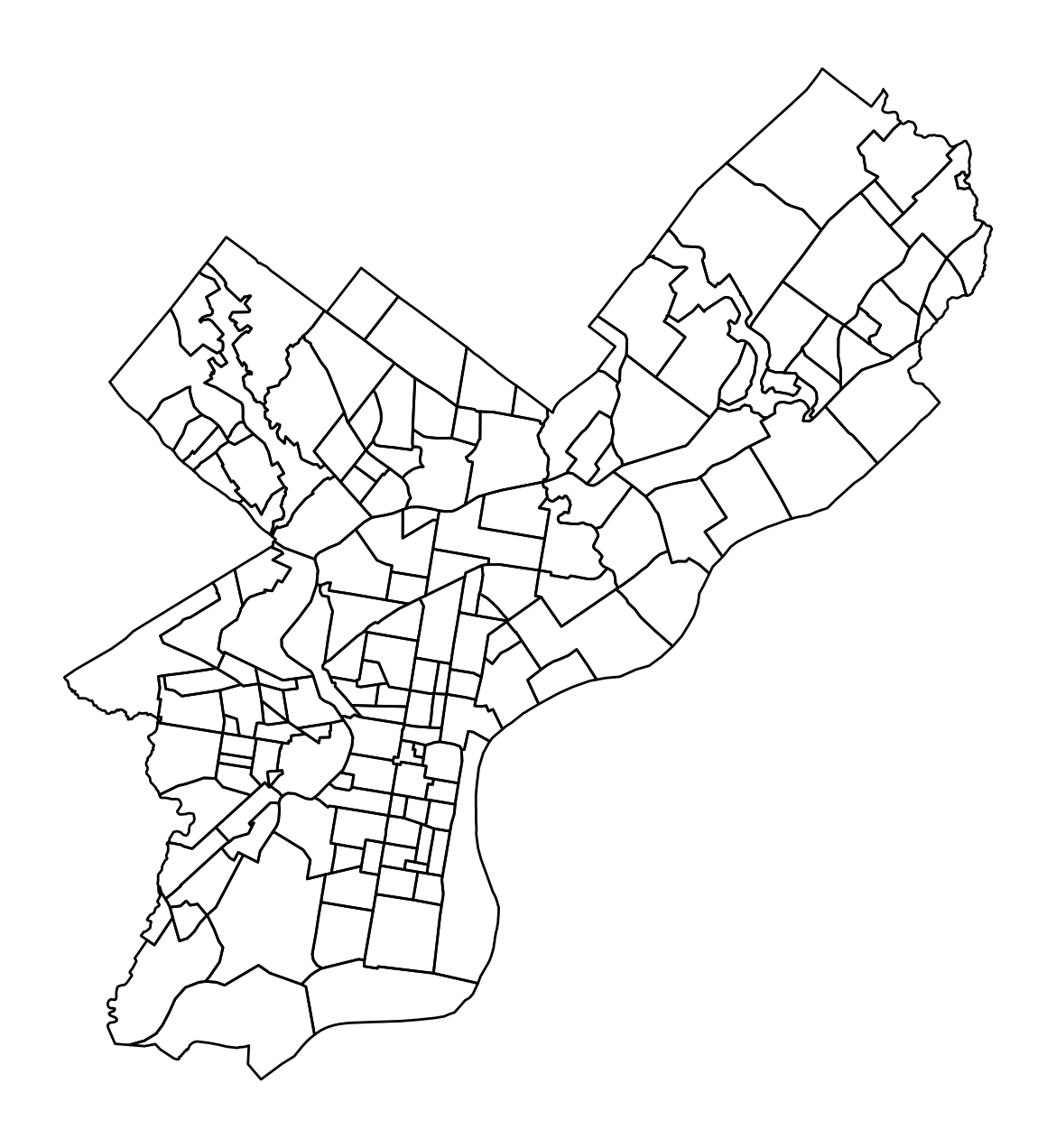
2. Do a spatial join between requests and neighborhoods
Use the sjoin() function to match point data (requests) to polygon data (neighborhoods) based on which neighborhood each request location is within.
Important
Make sure the two GeoDataFrames are in the same CRS when calculating a spatial join! If not, geopandas will print out a warning.
requests_with_hood = gpd.sjoin(
    trash_requests,  # The point data for 311 tickets
    zillow.to_crs(trash_requests.crs),  # The neighborhoods (in the same CRS)
    predicate="within",
    how="left",
)requests_with_hood.head()| objectid | service_request_id | status | status_notes | service_name | service_code | agency_responsible | service_notice | requested_datetime | updated_datetime | expected_datetime | address | zipcode | media_url | lat | lon | geometry | index_right | ZillowName | |
|---|---|---|---|---|---|---|---|---|---|---|---|---|---|---|---|---|---|---|---|
| 0 | 8180042 | 13269656 | Closed | NaN | Rubbish/Recyclable Material Collection | SR-ST03 | Streets Department | 2 Business Days | 2020-04-02 19:22:24 | 2020-04-06 07:02:57 | 2020-04-06 20:00:00 | 624 FOULKROD ST | NaN | NaN | 40.034389 | -75.106518 | POINT (-75.10652 40.03439) | 70.0 | Lawndale |
| 1 | 8180043 | 13266979 | Closed | NaN | Rubbish/Recyclable Material Collection | SR-ST03 | Streets Department | 2 Business Days | 2020-04-02 08:40:53 | 2020-04-06 07:02:58 | 2020-04-05 20:00:00 | 1203 ELLSWORTH ST | NaN | NaN | 39.936164 | -75.163497 | POINT (-75.16350 39.93616) | 105.0 | Passyunk Square |
| 2 | 7744426 | 13066443 | Closed | NaN | Rubbish/Recyclable Material Collection | SR-ST03 | Streets Department | 2 Business Days | 2020-01-02 19:17:55 | 2020-01-04 05:46:06 | 2020-01-06 19:00:00 | 9054 WESLEYAN RD | NaN | NaN | 40.058737 | -75.018345 | POINT (-75.01835 40.05874) | 109.0 | Pennypack Woods |
| 3 | 7744427 | 13066540 | Closed | NaN | Rubbish/Recyclable Material Collection | SR-ST03 | Streets Department | 2 Business Days | 2020-01-03 07:01:46 | 2020-01-04 05:46:07 | 2020-01-06 19:00:00 | 2784 WILLITS RD | NaN | NaN | 40.063658 | -75.022347 | POINT (-75.02235 40.06366) | 107.0 | Pennypack |
| 4 | 7801094 | 13089345 | Closed | NaN | Rubbish/Recyclable Material Collection | SR-ST03 | Streets Department | 2 Business Days | 2020-01-15 13:22:14 | 2020-01-16 14:03:29 | 2020-01-16 19:00:00 | 6137 LOCUST ST | NaN | NaN | 39.958186 | -75.244732 | POINT (-75.24473 39.95819) | 21.0 | Cobbs Creek |
3. Group by neighborhood and calculate the size
totals = requests_with_hood.groupby("ZillowName", as_index=False).size()

type(totals)pandas.core.frame.DataFrameNote: we’re once again using the as_index=False to ensure the result of the .size() function is a DataFrame rather than a Series with the ZillowName as its index
totals.head()| ZillowName | size | |
|---|---|---|
| 0 | Academy Gardens | 84 |
| 1 | Allegheny West | 330 |
| 2 | Andorra | 83 |
| 3 | Aston Woodbridge | 110 |
| 4 | Bartram Village | 35 |
4. Merge our geometries back in
Lastly, merge Zillow geometries (GeoDataFrame) with the total # of requests per neighborhood (DataFrame).
Important
When merging a GeoDataFrame (spatial) and DataFrame (non-spatial), you should always call the .merge() function of the spatial data set to ensure that the merged data is a GeoDataFrame.
For example…
# Do GeoDataFrame.merge(DataFrame) here...
requests_by_hood = zillow.merge(totals, on="ZillowName")requests_by_hood.head()| ZillowName | geometry | size | |
|---|---|---|---|
| 0 | Academy Gardens | POLYGON ((-74.99851 40.06435, -74.99456 40.061... | 84 |
| 1 | Allegheny West | POLYGON ((-75.16592 40.00327, -75.16596 40.003... | 330 |
| 2 | Andorra | POLYGON ((-75.22463 40.06686, -75.22588 40.065... | 83 |
| 3 | Aston Woodbridge | POLYGON ((-75.00860 40.05369, -75.00861 40.053... | 110 |
| 4 | Bartram Village | POLYGON ((-75.20733 39.93350, -75.20733 39.933... | 35 |
We’ll do some plotting below, so let’s convert to a more accurate CRS and save a new version:
requests_by_hood_3857 = requests_by_hood.to_crs(epsg=3857)Data viz example: Choropleth maps
Choropleth maps color polygon regions according to the values of a specific data attribute. In this section, we’ll explore a number of different ways to plot them in Python.
Static via the geopandas plot() function
Choropleth maps are built-in to GeoDataFrame objects via the plot() function. Let’s use the “size” column to plot the total number of requests per neighborhood:
# Create the figure/axes
fig, ax = plt.subplots(figsize=(8, 8))

# Plot
requests_by_hood_3857.plot(
    ax=ax,
    column="size",  # NEW: Specify the column to color polygons by
    edgecolor="white",
    linewidth=0.5,
    legend=True,
    cmap="viridis",
)

# Format
ax.set_axis_off()
ax.set_aspect("equal")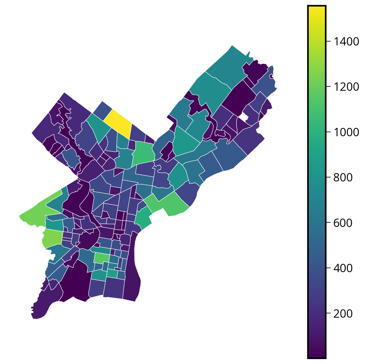
1. Improving the aesthetics
Two optional but helpful improvements: - Make the colorbar line up with the axes. The default configuration will always overshoot the axes. - Explicitly set the limits of the x-axis and y-axis to zoom in and center the map
# Needed to line up the colorbar properly
from mpl_toolkits.axes_grid1 import make_axes_locatable
# Create the figure
fig, ax = plt.subplots(figsize=(8, 8))
# NEW: Create a nice, lined up colorbar axes (called "cax" here)
divider = make_axes_locatable(ax)
cax = divider.append_axes("right", size="5%", pad=0.2)
# Plot
requests_by_hood_3857.plot(
ax=ax,
cax=cax, # NEW
column="size",
edgecolor="white",
linewidth=0.5,
legend=True,
cmap="viridis",
)
# NEW: Get the limits of the GeoDataFrame
xmin, ymin, xmax, ymax = requests_by_hood_3857.total_bounds
# NEW: Set the xlims and ylims
ax.set_xlim(xmin, xmax)
ax.set_ylim(ymin, ymax)
# Format
ax.set_axis_off()
ax.set_aspect("equal")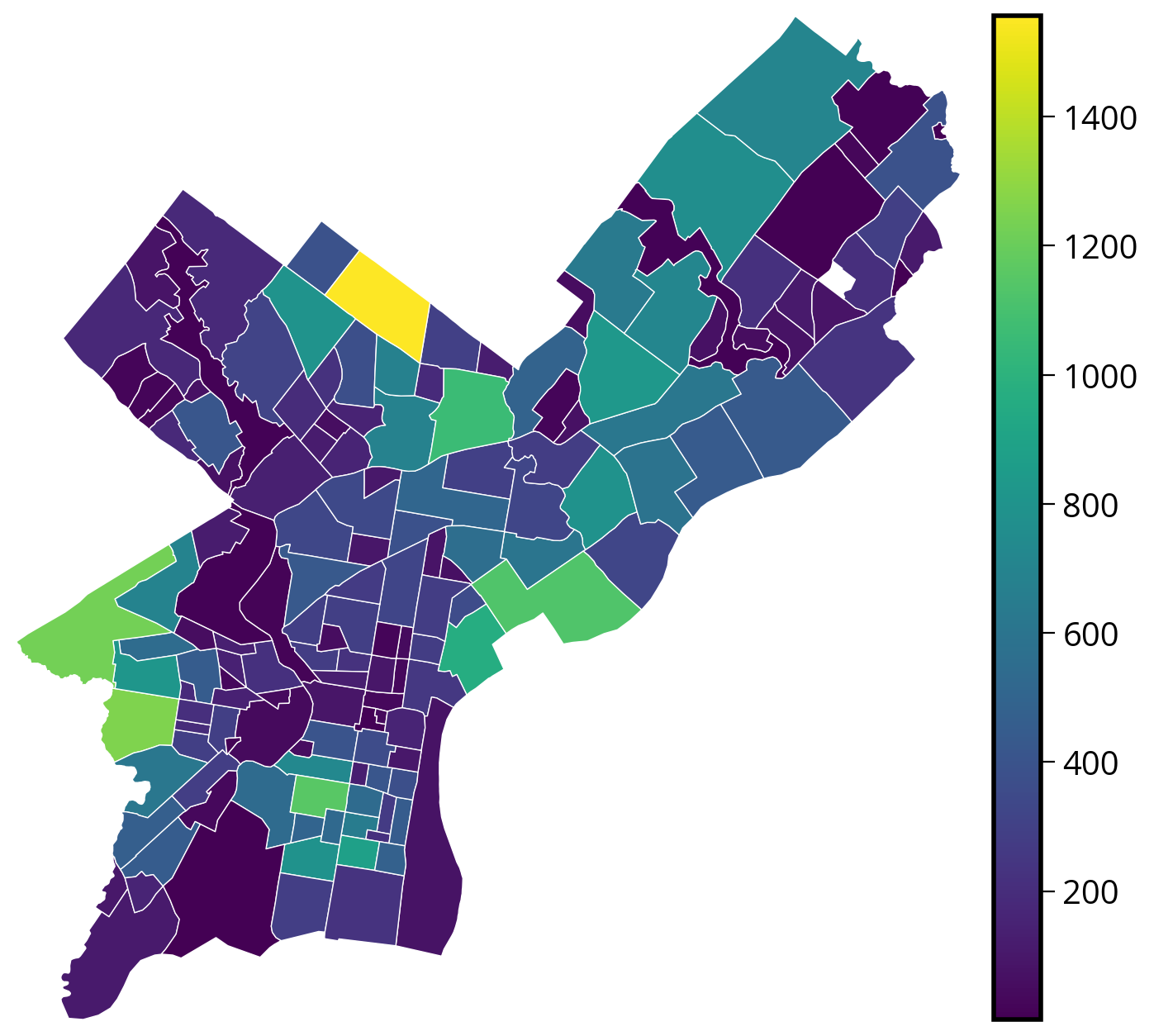
These improvements are optional, but they definitely make for nicer plots!
2. Improving the data
Problem: The variation in the sizes of neighborhoods across the city makes it hard to compare raw counts in a choropleth map.
Better to normalize by area: use the .area attribute of the geometry series
requests_by_hood_3857["N_per_area"] = (
    requests_by_hood_3857["size"] / (requests_by_hood_3857.geometry.area) * 1e4
)
Now plot the normalized totals:
# Create the figure
fig, ax = plt.subplots(figsize=(8, 8))

# Create a nice, lined up colorbar axes (called "cax" here)
divider = make_axes_locatable(ax)
cax = divider.append_axes("right", size="5%", pad=0.2)

# Plot
requests_by_hood_3857.plot(
    ax=ax,
    cax=cax,
    column="N_per_area",  # NEW: Use the normalized column
    edgecolor="white",
    linewidth=0.5,
    legend=True,
    cmap="viridis",
)

# Get the limits of the GeoDataFrame
xmin, ymin, xmax, ymax = requests_by_hood_3857.total_bounds

# Set the xlims and ylims
ax.set_xlim(xmin, xmax)
ax.set_ylim(ymin, ymax)

# Format
ax.set_axis_off()
ax.set_aspect("equal")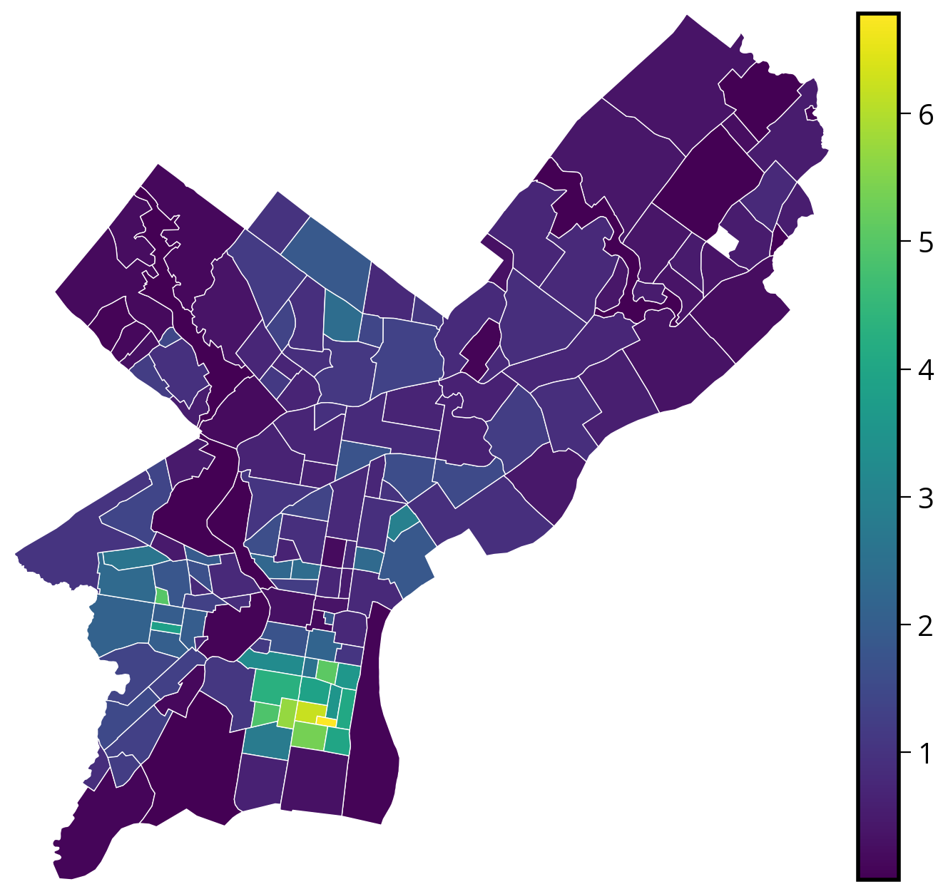
Even better…
Since households are driving the 311 requests, it would be even better to normalize by the number of properties in a given neighborhood rather than neighborhood area.
3. Improving the color mapping
By default, geopandas just maps the data to a continuous color bar. Sometimes, it is helpful to instead classify the data into bins and visualize the separate bins. This can help highlight trends not immediately clear when using a continuous color mapping.
Classification via bins is built-in to the plot() function! Many different schemes, but here are some of the most common ones:
- Quantiles: assigns the same number of data points per bin
- EqualInterval: divides the range of the data into equally sized bins
- FisherJenks: scheme that tries to minimize the variance within each bin and maximize the variances between different bins.
Trying out multiple classification schemes can help you figure out trends more easily during your exploratory analysis!
- Quantiles Scheme: assigns the same number of data points per bin
# Initialize figure and axes
fig, ax = plt.subplots(figsize=(8, 5), facecolor="#e5e7eb")

# Plot
requests_by_hood_3857.plot(
    ax=ax,
    column="N_per_area",
    edgecolor="black",
    linewidth=0.5,
    legend=True,
    legend_kwds=dict(loc="lower right", fontsize=10),
    cmap="Reds",
    scheme="Quantiles", # NEW
    k=5, # NEW
)

# Format
ax.set_title("Quantiles: k = 5")
ax.set_axis_off()
ax.set_aspect("equal")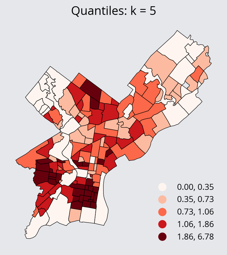
- Equal Interval Scheme: divides the range of the data into equally sized bins
# Initialize figure and axes
fig, ax = plt.subplots(figsize=(8, 5), facecolor="#e5e7eb")

# Plot
requests_by_hood_3857.plot(
    ax=ax,
    column="N_per_area",
    edgecolor="black",
    linewidth=0.5,
    legend=True,
    legend_kwds=dict(loc="lower right", fontsize=10),
    cmap="Reds",
    scheme="EqualInterval",
    k=5,
)

# Format
ax.set_title("Equal Interval: k = 5")
ax.set_axis_off()
ax.set_aspect("equal")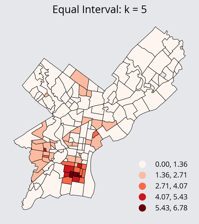
- Fisher Jenks Scheme: minimize the variance within each bin and maximize the variances between different bins.
# Initialize figure and axes
fig, ax = plt.subplots(figsize=(8, 5), facecolor="#e5e7eb")

# Plot
requests_by_hood_3857.plot(
    ax=ax,
    column="N_per_area",
    edgecolor="black",
    linewidth=0.5,
    legend=True,
    legend_kwds=dict(loc="lower right", fontsize=10),
    cmap="Reds",
    scheme="FisherJenks",
)

# Format
ax.set_title("Fisher Jenks: k = 5")
ax.set_axis_off()
ax.set_aspect("equal")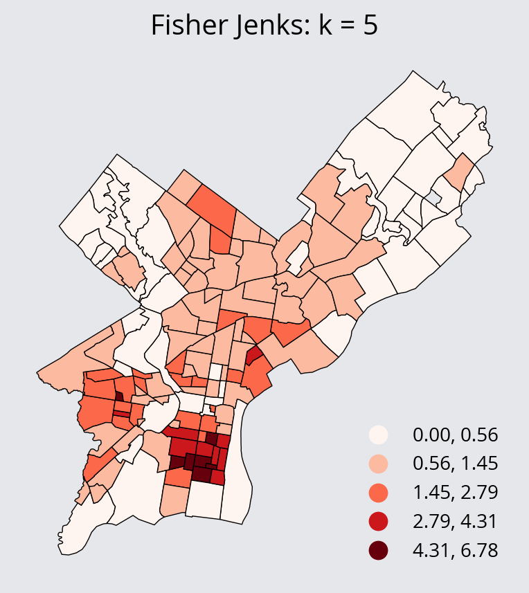
Tip
Geopandas relies on an external package called mapclassify for the classification schemes. The documentation can be found here: https://pysal.org/mapclassify/api.html
It contains the full list of schemes and the function definitions for each.
Interactive via altair
Altair charts accept GeoDataFrames as data and altair includes a “geoshape” mark, so choropleths are easy to make.
Altair and projections
Altair’s support for different projections isn’t the best. The recommended strategy is to convert your data to the desired CRS (e.g., EPSG:3857 or the local state plane projection (EPSG:2272 for Philadelphia)) and then tell altair not to project your data by including the following:
chart.project(type="identity", reflectY=True)(
alt.Chart(requests_by_hood_3857)
.mark_geoshape(stroke="white")
.encode(
tooltip=["N_per_area:Q", "ZillowName:N", "size:Q"],
color=alt.Color("N_per_area:Q", scale=alt.Scale(scheme="viridis")),
)
# Important! Otherwise altair will try to re-project your data
.project(type="identity", reflectY=True)
.properties(width=500, height=500)
)Interactive via hvplot
We can use the built-in .hvplot() function to plot interactive choropleth maps!
Hvplot and projections
There are two relevant keywords related to projections and coordinate reference systems. Since we are plotting geospatial data, you will need to specify the geo=True keyword. If your data is in EPSG:4326, you are all set and that’s all you need to do. If your data is NOT in EPSG:4326, you will need to specify the crs= keyword and pass the EPSG code to hvplot.
In the example below, our data is in EPSG:3857 and we specify that via the crs keyword.
requests_by_hood_3857.crs<Projected CRS: EPSG:3857>
Name: WGS 84 / Pseudo-Mercator
Axis Info [cartesian]:
- X[east]: Easting (metre)
- Y[north]: Northing (metre)
Area of Use:
- name: World between 85.06°S and 85.06°N.
- bounds: (-180.0, -85.06, 180.0, 85.06)
Coordinate Operation:
- name: Popular Visualisation Pseudo-Mercator
- method: Popular Visualisation Pseudo Mercator
Datum: World Geodetic System 1984 ensemble
- Ellipsoid: WGS 84
- Prime Meridian: Greenwich# Pass arguments directly to hvplot()
# and it recognizes polygons automatically
requests_by_hood_3857.hvplot(
c="N_per_area",
frame_width=600,
frame_height=600,
geo=True,
crs=3857,
cmap="viridis",
hover_cols=["ZillowName"],
)Adding in tile maps underneath with geoviews
hvplot can leverage the power of geoviews, the geographic equivalent of holoviews, to add in base tile maps underneath our choropleth map.
Let’s try it out:
import geoviews as gv
import geoviews.tile_sources as gvtstype(gvts.EsriImagery)geoviews.element.geo.WMTS%%opts WMTS [width=800, height=800, xaxis=None, yaxis=None]
choro = requests_by_hood_3857.hvplot(
c="N_per_area",
frame_width=600,
frame_height=600,
alpha=0.5,
geo=True,
crs=3857,
cmap="viridis",
hover_cols=["ZillowName"],
)
gvts.EsriImagery * choro
Warning
For the moment, you’ll need to have your overlaid polygons in Web Mercator, EPSG:3857. There’s a bug in geoviews that is preventing the underlying raster data from showing properly when combined with data that is using a different CRS.
Many of the most common tile sources are available..
Stay tuned: More on this next week when we talk about raster data!
%%opts WMTS [width=200, height=200, xaxis=None, yaxis=None]

(
    gvts.OSM
    + gvts.StamenToner
    + gvts.EsriNatGeo
    + gvts.EsriImagery
    + gvts.EsriUSATopo
    + gvts.EsriTerrain
    + gvts.CartoDark
    + gvts.CartoLight
).cols(4)
Note
We’ve used the %%opts cell magic to apply syling options to any charts generated in the cell.
See the documentation guide on customizations for more details.
Interactive via the geopandas .explore() function
Geopandas recently introduced the ability to produce interactive choropleth maps via the .explore() function. It leverages the Folium package to produce an interactive web map.
Stay tuned: We’ll discuss interactive web maps and the Folium package in much more detail next week!
requests_by_hood_3857.explore(
    column="N_per_area",  # Similar to plot(); specify the value column
    cmap="viridis",  # What color map do we want to use
    tiles="CartoDB positron",  # What basemap tiles do we want to use?
)
Make this Notebook Trusted to load map: File -> Trust Notebook
Tip
Check out the documentation for .explore() via the ? operator for details on what kind of tiles are available as well as other options.
For more information, see the Geopandas documentation on interactive mapping.
Data viz example: Hex bins
Another great way to visualize geospatial data is via hex bins, where hexagonal bins aggregate quantities over small spatial regions. Let’s try out a couple different ways of visualizing our data this way.
Note
When visualizing data with hex bins, we will pass the full dataset (before any aggregations) to the plotting function, which will handle aggregating the data into hexagonal bins and visualizing it.
Optional aggregations
By default, the function will just count the number of points that fall into each hexagonal bin. Optionally, we can also specify a column to aggregate in each bin, and a corresponding function to use to do the aggregation (e.g., the sum or median function). These are specified as:
- An optional
Ccolumn to aggregate for each bin (raw counts are shown if not provided) - A
reduce_C_functionthat determines how to aggregate theCcolumn
Static via matplotlib
Let’s try out matplotlib’s hexbin() function (docs), and overlay the Zillow neighborhood boundaries on top!
plt.hexbin?Signature: plt.hexbin( x, y, C=None, gridsize=100, bins=None, xscale='linear', yscale='linear', extent=None, cmap=None, norm=None, vmin=None, vmax=None, alpha=None, linewidths=None, edgecolors='face', reduce_C_function=<function mean at 0x10884b9a0>, mincnt=None, marginals=False, *, data=None, **kwargs, ) Docstring: Make a 2D hexagonal binning plot of points *x*, *y*. If *C* is *None*, the value of the hexagon is determined by the number of points in the hexagon. Otherwise, *C* specifies values at the coordinate (x[i], y[i]). For each hexagon, these values are reduced using *reduce_C_function*. Parameters ---------- x, y : array-like The data positions. *x* and *y* must be of the same length. C : array-like, optional If given, these values are accumulated in the bins. Otherwise, every point has a value of 1. Must be of the same length as *x* and *y*. gridsize : int or (int, int), default: 100 If a single int, the number of hexagons in the *x*-direction. The number of hexagons in the *y*-direction is chosen such that the hexagons are approximately regular. Alternatively, if a tuple (*nx*, *ny*), the number of hexagons in the *x*-direction and the *y*-direction. In the *y*-direction, counting is done along vertically aligned hexagons, not along the zig-zag chains of hexagons; see the following illustration. .. plot:: import numpy import matplotlib.pyplot as plt np.random.seed(19680801) n= 300 x = np.random.standard_normal(n) y = np.random.standard_normal(n) fig, ax = plt.subplots(figsize=(4, 4)) h = ax.hexbin(x, y, gridsize=(5, 3)) hx, hy = h.get_offsets().T ax.plot(hx[24::3], hy[24::3], 'ro-') ax.plot(hx[-3:], hy[-3:], 'ro-') ax.set_title('gridsize=(5, 3)') ax.axis('off') To get approximately regular hexagons, choose :math:`n_x = \sqrt{3}\,n_y`. bins : 'log' or int or sequence, default: None Discretization of the hexagon values. - If *None*, no binning is applied; the color of each hexagon directly corresponds to its count value. - If 'log', use a logarithmic scale for the colormap. Internally, :math:`log_{10}(i+1)` is used to determine the hexagon color. This is equivalent to ``norm=LogNorm()``. - If an integer, divide the counts in the specified number of bins, and color the hexagons accordingly. - If a sequence of values, the values of the lower bound of the bins to be used. xscale : {'linear', 'log'}, default: 'linear' Use a linear or log10 scale on the horizontal axis. yscale : {'linear', 'log'}, default: 'linear' Use a linear or log10 scale on the vertical axis. mincnt : int > 0, default: *None* If not *None*, only display cells with more than *mincnt* number of points in the cell. marginals : bool, default: *False* If marginals is *True*, plot the marginal density as colormapped rectangles along the bottom of the x-axis and left of the y-axis. extent : 4-tuple of float, default: *None* The limits of the bins (xmin, xmax, ymin, ymax). The default assigns the limits based on *gridsize*, *x*, *y*, *xscale* and *yscale*. If *xscale* or *yscale* is set to 'log', the limits are expected to be the exponent for a power of 10. E.g. for x-limits of 1 and 50 in 'linear' scale and y-limits of 10 and 1000 in 'log' scale, enter (1, 50, 1, 3). Returns ------- `~matplotlib.collections.PolyCollection` A `.PolyCollection` defining the hexagonal bins. - `.PolyCollection.get_offsets` contains a Mx2 array containing the x, y positions of the M hexagon centers. - `.PolyCollection.get_array` contains the values of the M hexagons. If *marginals* is *True*, horizontal bar and vertical bar (both PolyCollections) will be attached to the return collection as attributes *hbar* and *vbar*. Other Parameters ---------------- cmap : str or `~matplotlib.colors.Colormap`, default: :rc:`image.cmap` The Colormap instance or registered colormap name used to map scalar data to colors. norm : str or `~matplotlib.colors.Normalize`, optional The normalization method used to scale scalar data to the [0, 1] range before mapping to colors using *cmap*. By default, a linear scaling is used, mapping the lowest value to 0 and the highest to 1. If given, this can be one of the following: - An instance of `.Normalize` or one of its subclasses (see :doc:`/tutorials/colors/colormapnorms`). - A scale name, i.e. one of "linear", "log", "symlog", "logit", etc. For a list of available scales, call `matplotlib.scale.get_scale_names()`. In that case, a suitable `.Normalize` subclass is dynamically generated and instantiated. vmin, vmax : float, optional When using scalar data and no explicit *norm*, *vmin* and *vmax* define the data range that the colormap covers. By default, the colormap covers the complete value range of the supplied data. It is an error to use *vmin*/*vmax* when a *norm* instance is given (but using a `str` *norm* name together with *vmin*/*vmax* is acceptable). alpha : float between 0 and 1, optional The alpha blending value, between 0 (transparent) and 1 (opaque). linewidths : float, default: *None* If *None*, defaults to 1.0. edgecolors : {'face', 'none', *None*} or color, default: 'face' The color of the hexagon edges. Possible values are: - 'face': Draw the edges in the same color as the fill color. - 'none': No edges are drawn. This can sometimes lead to unsightly unpainted pixels between the hexagons. - *None*: Draw outlines in the default color. - An explicit color. reduce_C_function : callable, default: `numpy.mean` The function to aggregate *C* within the bins. It is ignored if *C* is not given. This must have the signature:: def reduce_C_function(C: array) -> float Commonly used functions are: - `numpy.mean`: average of the points - `numpy.sum`: integral of the point values - `numpy.amax`: value taken from the largest point data : indexable object, optional If given, the following parameters also accept a string ``s``, which is interpreted as ``data[s]`` (unless this raises an exception): *x*, *y*, *C* **kwargs : `~matplotlib.collections.PolyCollection` properties All other keyword arguments are passed on to `.PolyCollection`: Properties: agg_filter: a filter function, which takes a (m, n, 3) float array and a dpi value, and returns a (m, n, 3) array and two offsets from the bottom left corner of the image alpha: array-like or scalar or None animated: bool antialiased or aa or antialiaseds: bool or list of bools array: array-like or None capstyle: `.CapStyle` or {'butt', 'projecting', 'round'} clim: (vmin: float, vmax: float) clip_box: `.Bbox` clip_on: bool clip_path: Patch or (Path, Transform) or None cmap: `.Colormap` or str or None color: color or list of RGBA tuples edgecolor or ec or edgecolors: color or list of colors or 'face' facecolor or facecolors or fc: color or list of colors figure: `.Figure` gid: str hatch: {'/', '\\', '|', '-', '+', 'x', 'o', 'O', '.', '*'} in_layout: bool joinstyle: `.JoinStyle` or {'miter', 'round', 'bevel'} label: object linestyle or dashes or linestyles or ls: str or tuple or list thereof linewidth or linewidths or lw: float or list of floats mouseover: bool norm: `.Normalize` or str or None offset_transform or transOffset: unknown offsets: (N, 2) or (2,) array-like path_effects: `.AbstractPathEffect` paths: list of array-like picker: None or bool or float or callable pickradius: unknown rasterized: bool sizes: `numpy.ndarray` or None sketch_params: (scale: float, length: float, randomness: float) snap: bool or None transform: `.Transform` url: str urls: list of str or None verts: list of array-like verts_and_codes: unknown visible: bool zorder: float See Also -------- hist2d : 2D histogram rectangular bins File: ~/mambaforge/envs/musa-550-fall-2023/lib/python3.10/site-packages/matplotlib/pyplot.py Type: function
trash_requests_3857 = trash_requests.to_crs(epsg=3857)# Create the axes
fig, ax = plt.subplots(figsize=(12, 12))
# Extract out the x/y coordindates of the Point objects
xcoords = trash_requests_3857.geometry.x
ycoords = trash_requests_3857.geometry.y
# Plot a hexbin chart
# NOTE: We are passing the full set of coordinates to matplotlib — we haven't done any aggregations
hex_vals = ax.hexbin(xcoords, ycoords, gridsize=50)
# Add the zillow geometry boundaries
zillow.to_crs(trash_requests_3857.crs).plot(
ax=ax, facecolor="none", edgecolor="white", linewidth=0.25
)
# Add a colorbar and format
fig.colorbar(hex_vals, ax=ax)
ax.set_axis_off()
ax.set_aspect("equal")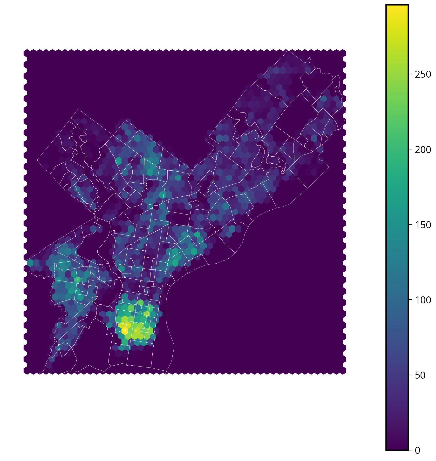
Great! This looks very close to the N_per_area choropleth chart we made previously. It definitely shows a similar concentration of tickets in South Philly.
Interactive via hvplot
Hvplot also has an interactive hex bin function…let’s try it out!
Remember: once again, we’ll be using the original (un-aggregated) data frame.
Step 1: Extract out the x/y values of the data
- Let’s add them as new columns into the data frame
- Remember, you can the use “x” and “y” attributes of the “geometry” column.
trash_requests_3857["x"] = trash_requests_3857.geometry.x
trash_requests_3857["y"] = trash_requests_3857.geometry.ytrash_requests_3857.head()| objectid | service_request_id | status | status_notes | service_name | service_code | agency_responsible | service_notice | requested_datetime | updated_datetime | expected_datetime | address | zipcode | media_url | lat | lon | geometry | x | y | |
|---|---|---|---|---|---|---|---|---|---|---|---|---|---|---|---|---|---|---|---|
| 0 | 8180042 | 13269656 | Closed | NaN | Rubbish/Recyclable Material Collection | SR-ST03 | Streets Department | 2 Business Days | 2020-04-02 19:22:24 | 2020-04-06 07:02:57 | 2020-04-06 20:00:00 | 624 FOULKROD ST | NaN | NaN | 40.034389 | -75.106518 | POINT (-8360819.322 4870940.907) | -8.360819e+06 | 4.870941e+06 |
| 1 | 8180043 | 13266979 | Closed | NaN | Rubbish/Recyclable Material Collection | SR-ST03 | Streets Department | 2 Business Days | 2020-04-02 08:40:53 | 2020-04-06 07:02:58 | 2020-04-05 20:00:00 | 1203 ELLSWORTH ST | NaN | NaN | 39.936164 | -75.163497 | POINT (-8367162.212 4856670.199) | -8.367162e+06 | 4.856670e+06 |
| 2 | 7744426 | 13066443 | Closed | NaN | Rubbish/Recyclable Material Collection | SR-ST03 | Streets Department | 2 Business Days | 2020-01-02 19:17:55 | 2020-01-04 05:46:06 | 2020-01-06 19:00:00 | 9054 WESLEYAN RD | NaN | NaN | 40.058737 | -75.018345 | POINT (-8351004.015 4874481.442) | -8.351004e+06 | 4.874481e+06 |
| 3 | 7744427 | 13066540 | Closed | NaN | Rubbish/Recyclable Material Collection | SR-ST03 | Streets Department | 2 Business Days | 2020-01-03 07:01:46 | 2020-01-04 05:46:07 | 2020-01-06 19:00:00 | 2784 WILLITS RD | NaN | NaN | 40.063658 | -75.022347 | POINT (-8351449.489 4875197.202) | -8.351449e+06 | 4.875197e+06 |
| 4 | 7801094 | 13089345 | Closed | NaN | Rubbish/Recyclable Material Collection | SR-ST03 | Streets Department | 2 Business Days | 2020-01-15 13:22:14 | 2020-01-16 14:03:29 | 2020-01-16 19:00:00 | 6137 LOCUST ST | NaN | NaN | 39.958186 | -75.244732 | POINT (-8376205.240 4859867.796) | -8.376205e+06 | 4.859868e+06 |
Step 2: Plot with the hexbin function
- Similar syntax to matplotlib’s hexbin() function
- Specify:
- The x/y coordinates,
- An optional
Ccolumn to aggregate for each bin (raw counts are shown if not provided) - A
reduce_functionthat determines how to aggregate theCcolumn
trash_requests.hvplot.hexbin?Signature: trash_requests.hvplot.hexbin( x=None, y=None, C=None, colorbar=True, *, alpha, cmap, color, fill_alpha, fill_color, hover_alpha, hover_color, hover_fill_alpha, hover_fill_color, hover_line_alpha, hover_line_cap, hover_line_color, hover_line_dash, hover_line_join, hover_line_width, line_alpha, line_cap, line_color, line_dash, line_join, line_width, muted, muted_alpha, muted_color, muted_fill_alpha, muted_fill_color, muted_line_alpha, muted_line_cap, muted_line_color, muted_line_dash, muted_line_join, muted_line_width, nonselection_alpha, nonselection_color, nonselection_fill_alpha, nonselection_fill_color, nonselection_line_alpha, nonselection_line_cap, nonselection_line_color, nonselection_line_dash, nonselection_line_join, nonselection_line_width, scale, selection_alpha, selection_color, selection_fill_alpha, selection_fill_color, selection_line_alpha, selection_line_cap, selection_line_color, selection_line_dash, selection_line_join, selection_line_width, visible, reduce_function, gridsize, logz, min_count, width, height, shared_axes, grid, legend, rot, xlim, ylim, xticks, yticks, invert, title, logx, logy, loglog, xaxis, yaxis, xformatter, yformatter, xlabel, ylabel, clabel, padding, responsive, max_height, max_width, min_height, min_width, frame_height, frame_width, aspect, data_aspect, fontscale, datashade, rasterize, x_sampling, y_sampling, aggregator, **kwargs, ) Docstring: The `hexbin` plot uses hexagons to split the area into several parts and attribute a color to it. `hexbin` offers a straightforward method for plotting dense data. Reference: https://hvplot.holoviz.org/reference/pandas/hexbin.html Parameters ---------- x : string, optional Field name to draw x coordinates from. If not specified, the index is used. y : string Field name to draw y-positions from C : string, optional Field to draw hexbin color from. If not specified a simple count will be used. colorbar: boolean, optional Whether to display a colorbar. Default is True. reduce_function : function, optional Function to compute statistics for hexbins, for example `np.mean`. gridsize: int, optional The number of hexagons in the x-direction logz : bool Whether to apply log scaling to the z-axis. Default is False. min_count : number, optional The display threshold before a bin is shown, by default bins with a count of less than 1 are hidden **kwds : optional Additional keywords arguments are documented in `hvplot.help('hexbin')`. Returns ------- A Holoviews object. You can `print` the object to study its composition and run .. code-block:: import holoviews as hv hv.help(the_holoviews_object) to learn more about its parameters and options. Example ------- .. code-block:: import hvplot.pandas import pandas as pd import numpy as np n = 500 df = pd.DataFrame({ "x": 2 + 2 * np.random.standard_normal(n), "y": 2 + 2 * np.random.standard_normal(n), }) df.hvplot.hexbin("x", "y", clabel="Count", cmap="plasma_r", height=400, width=500) References ---------- - Bokeh: https://docs.bokeh.org/en/latest/docs/gallery/hexbin.html - HoloViews: https://holoviews.org/reference/elements/bokeh/HexTiles.html - Plotly: https://plotly.com/python/hexbin-mapbox/ - Wiki: https://think.design/services/data-visualization-data-design/hexbin/ Generic options --------------- clim: tuple Lower and upper bound of the color scale cnorm (default='linear'): str Color scaling which must be one of 'linear', 'log' or 'eq_hist' colorbar (default=False): boolean Enables a colorbar fontscale: number Scales the size of all fonts by the same amount, e.g. fontscale=1.5 enlarges all fonts (title, xticks, labels etc.) by 50% fontsize: number or dict Set title, label and legend text to the same fontsize. Finer control by using a dict: {'title': '15pt', 'ylabel': '5px', 'ticks': 20} flip_xaxis/flip_yaxis: boolean Whether to flip the axis left to right or up and down respectively grid (default=False): boolean Whether to show a grid hover : boolean Whether to show hover tooltips, default is True unless datashade is True in which case hover is False by default hover_cols (default=[]): list or str Additional columns to add to the hover tool or 'all' which will includes all columns (including indexes if use_index is True). invert (default=False): boolean Swaps x- and y-axis frame_width/frame_height: int The width and height of the data area of the plot legend (default=True): boolean or str Whether to show a legend, or a legend position ('top', 'bottom', 'left', 'right') logx/logy (default=False): boolean Enables logarithmic x- and y-axis respectively logz (default=False): boolean Enables logarithmic colormapping loglog (default=False): boolean Enables logarithmic x- and y-axis max_width/max_height: int The maximum width and height of the plot for responsive modes min_width/min_height: int The minimum width and height of the plot for responsive modes padding: number or tuple Fraction by which to increase auto-ranged extents to make datapoints more visible around borders. Supports tuples to specify different amount of padding for x- and y-axis and tuples of tuples to specify different amounts of padding for upper and lower bounds. rescale_discrete_levels (default=True): boolean If `cnorm='eq_hist'` and there are only a few discrete values, then `rescale_discrete_levels=True` (the default) decreases the lower limit of the autoranged span so that the values are rendering towards the (more visible) top of the `cmap` range, thus avoiding washout of the lower values. Has no effect if `cnorm!=`eq_hist`. responsive: boolean Whether the plot should responsively resize depending on the size of the browser. Responsive mode will only work if at least one dimension of the plot is left undefined, e.g. when width and height or width and aspect are set the plot is set to a fixed size, ignoring any responsive option. rot: number Rotates the axis ticks along the x-axis by the specified number of degrees. shared_axes (default=True): boolean Whether to link axes between plots transforms (default={}): dict A dictionary of HoloViews dim transforms to apply before plotting title (default=''): str Title for the plot tools (default=[]): list List of tool instances or strings (e.g. ['tap', 'box_select']) xaxis/yaxis: str or None Whether to show the x/y-axis and whether to place it at the 'top'/'bottom' and 'left'/'right' respectively. xformatter/yformatter (default=None): str or TickFormatter Formatter for the x-axis and y-axis (accepts printf formatter, e.g. '%.3f', and bokeh TickFormatter) xlabel/ylabel/clabel (default=None): str Axis labels for the x-axis, y-axis, and colorbar xlim/ylim (default=None): tuple or list Plot limits of the x- and y-axis xticks/yticks (default=None): int or list Ticks along x- and y-axis specified as an integer, list of ticks positions, or list of tuples of the tick positions and labels width (default=700)/height (default=300): int The width and height of the plot in pixels attr_labels (default=None): bool Whether to use an xarray object's attributes as labels, defaults to None to allow best effort without throwing a warning. Set to True to see warning if the attrs can't be found, set to False to disable the behavior. sort_date (default=True): bool Whether to sort the x-axis by date before plotting symmetric (default=None): bool Whether the data are symmetric around zero. If left unset, the data will be checked for symmetry as long as the size is less than ``check_symmetric_max``. check_symmetric_max (default=1000000): Size above which to stop checking for symmetry by default on the data. Datashader options ------------------ aggregator (default=None): Aggregator to use when applying rasterize or datashade operation (valid options include 'mean', 'count', 'min', 'max' and more, and datashader reduction objects) dynamic (default=True): Whether to return a dynamic plot which sends updates on widget and zoom/pan events or whether all the data should be embedded (warning: for large groupby operations embedded data can become very large if dynamic=False) datashade (default=False): Whether to apply rasterization and shading (colormapping) using the Datashader library, returning an RGB object instead of individual points dynspread (default=False): For plots generated with datashade=True or rasterize=True, automatically increase the point size when the data is sparse so that individual points become more visible rasterize (default=False): Whether to apply rasterization using the Datashader library, returning an aggregated Image (to be colormapped by the plotting backend) instead of individual points x_sampling/y_sampling (default=None): Specifies the smallest allowed sampling interval along the x/y axis. Geographic options ------------------ coastline (default=False): Whether to display a coastline on top of the plot, setting coastline='10m'/'50m'/'110m' specifies a specific scale. crs (default=None): Coordinate reference system of the data specified as Cartopy CRS object, proj.4 string or EPSG code. features (default=None): dict or list A list of features or a dictionary of features and the scale at which to render it. Available features include 'borders', 'coastline', 'lakes', 'land', 'ocean', 'rivers' and 'states'. Available scales include '10m'/'50m'/'110m'. geo (default=False): Whether the plot should be treated as geographic (and assume PlateCarree, i.e. lat/lon coordinates). global_extent (default=False): Whether to expand the plot extent to span the whole globe. project (default=False): Whether to project the data before plotting (adds initial overhead but avoids projecting data when plot is dynamically updated). projection (default=None): str or Cartopy CRS Coordinate reference system of the plot specified as Cartopy CRS object or class name. tiles (default=False): Whether to overlay the plot on a tile source. Tiles sources can be selected by name or a tiles object or class can be passed, the default is 'Wikipedia'. Style options ------------- alpha cmap color fill_alpha fill_color hover_alpha hover_color hover_fill_alpha hover_fill_color hover_line_alpha hover_line_cap hover_line_color hover_line_dash hover_line_join hover_line_width line_alpha line_cap line_color line_dash line_join line_width muted muted_alpha muted_color muted_fill_alpha muted_fill_color muted_line_alpha muted_line_cap muted_line_color muted_line_dash muted_line_join muted_line_width nonselection_alpha nonselection_color nonselection_fill_alpha nonselection_fill_color nonselection_line_alpha nonselection_line_cap nonselection_line_color nonselection_line_dash nonselection_line_join nonselection_line_width scale selection_alpha selection_color selection_fill_alpha selection_fill_color selection_line_alpha selection_line_cap selection_line_color selection_line_dash selection_line_join selection_line_width visible File: ~/mambaforge/envs/musa-550-fall-2023/lib/python3.10/site-packages/hvplot/plotting/core.py Type: method
trash_requests.head()| objectid | service_request_id | status | status_notes | service_name | service_code | agency_responsible | service_notice | requested_datetime | updated_datetime | expected_datetime | address | zipcode | media_url | lat | lon | geometry | |
|---|---|---|---|---|---|---|---|---|---|---|---|---|---|---|---|---|---|
| 0 | 8180042 | 13269656 | Closed | NaN | Rubbish/Recyclable Material Collection | SR-ST03 | Streets Department | 2 Business Days | 2020-04-02 19:22:24 | 2020-04-06 07:02:57 | 2020-04-06 20:00:00 | 624 FOULKROD ST | NaN | NaN | 40.034389 | -75.106518 | POINT (-75.10652 40.03439) |
| 1 | 8180043 | 13266979 | Closed | NaN | Rubbish/Recyclable Material Collection | SR-ST03 | Streets Department | 2 Business Days | 2020-04-02 08:40:53 | 2020-04-06 07:02:58 | 2020-04-05 20:00:00 | 1203 ELLSWORTH ST | NaN | NaN | 39.936164 | -75.163497 | POINT (-75.16350 39.93616) |
| 2 | 7744426 | 13066443 | Closed | NaN | Rubbish/Recyclable Material Collection | SR-ST03 | Streets Department | 2 Business Days | 2020-01-02 19:17:55 | 2020-01-04 05:46:06 | 2020-01-06 19:00:00 | 9054 WESLEYAN RD | NaN | NaN | 40.058737 | -75.018345 | POINT (-75.01835 40.05874) |
| 3 | 7744427 | 13066540 | Closed | NaN | Rubbish/Recyclable Material Collection | SR-ST03 | Streets Department | 2 Business Days | 2020-01-03 07:01:46 | 2020-01-04 05:46:07 | 2020-01-06 19:00:00 | 2784 WILLITS RD | NaN | NaN | 40.063658 | -75.022347 | POINT (-75.02235 40.06366) |
| 4 | 7801094 | 13089345 | Closed | NaN | Rubbish/Recyclable Material Collection | SR-ST03 | Streets Department | 2 Business Days | 2020-01-15 13:22:14 | 2020-01-16 14:03:29 | 2020-01-16 19:00:00 | 6137 LOCUST ST | NaN | NaN | 39.958186 | -75.244732 | POINT (-75.24473 39.95819) |
hexbins = trash_requests_3857.hvplot.hexbin(
    x="x",
    y="y",
    geo=True,
    crs=3857,
    gridsize=40,  # The number of cells in the x/y directions
    alpha=0.5,
    cmap="viridis",
    frame_width=600,
    frame_height=600,
)

# Add the imagery underneath
gvts.EsriImagery * hexbins
Which viz method is best?
We’ve seen a lot of different options for visualizing geospatial data so far. So, which was is best?
…It depends.
A few guiding principles: - If you’re looking to share the visualization with others, static is probably the better choice - If you’re doing an exploratory analysis, generally an interactive map will be more helpful for understanding trends - For exploratory, interactive analysis, ease of use is key — for this reason, I usually tend to use .hvplot() or .explore() rather than altair, which doesn’t add base tiles to the chart and is a bit more limited in its functionality
Note
More on interactive web maps next week when we discuss Folium in more detail!
Exercise: property assessments in Philadelphia
Goals: Visualize the property assessment values by neighborhood in Philadelphia, using one or more of the following:
- Static choropleth map via geopandas
- Interactive choropleth map via geopandas / altair / hvplot
- Static hex bin map via matplotlib
- Interactive hex bin map via hvplot
The dataset
- Property assessment data from OpenDataPhilly
- Available in the
data/folder - Residential properties only — over 460,000 properties
Step 1: Load the assessment data
data = pd.read_csv("./data/opa_residential.csv")
data.head()| parcel_number | lat | lng | location | market_value | building_value | land_value | total_land_area | total_livable_area | |
|---|---|---|---|---|---|---|---|---|---|
| 0 | 71361800 | 39.991575 | -75.128994 | 2726 A ST | 62200.0 | 44473.0 | 17727.0 | 1109.69 | 1638.0 |
| 1 | 71362100 | 39.991702 | -75.128978 | 2732 A ST | 25200.0 | 18018.0 | 7182.0 | 1109.69 | 1638.0 |
| 2 | 71362200 | 39.991744 | -75.128971 | 2734 A ST | 62200.0 | 44473.0 | 17727.0 | 1109.69 | 1638.0 |
| 3 | 71362600 | 39.991994 | -75.128895 | 2742 A ST | 15500.0 | 11083.0 | 4417.0 | 1109.69 | 1638.0 |
| 4 | 71363800 | 39.992592 | -75.128743 | 2814 A ST | 31300.0 | 22400.0 | 8900.0 | 643.50 | 890.0 |
We’ll focus on the market_value column for this analysis
Step 2: Convert to a GeoDataFrame
Remember to set the EPSG of the input data — this data is in the typical lat/lng coordinates (EPSG=4326)
data = data.dropna(subset=["lat", "lng"])gdata = gpd.GeoDataFrame(
data, # The pandas DataFrame
geometry=gpd.points_from_xy(data["lng"], data["lat"]), # The geometry!
crs="EPSG:4326", # The CRS
)gdata.head()| parcel_number | lat | lng | location | market_value | building_value | land_value | total_land_area | total_livable_area | geometry | |
|---|---|---|---|---|---|---|---|---|---|---|
| 0 | 71361800 | 39.991575 | -75.128994 | 2726 A ST | 62200.0 | 44473.0 | 17727.0 | 1109.69 | 1638.0 | POINT (-75.12899 39.99158) |
| 1 | 71362100 | 39.991702 | -75.128978 | 2732 A ST | 25200.0 | 18018.0 | 7182.0 | 1109.69 | 1638.0 | POINT (-75.12898 39.99170) |
| 2 | 71362200 | 39.991744 | -75.128971 | 2734 A ST | 62200.0 | 44473.0 | 17727.0 | 1109.69 | 1638.0 | POINT (-75.12897 39.99174) |
| 3 | 71362600 | 39.991994 | -75.128895 | 2742 A ST | 15500.0 | 11083.0 | 4417.0 | 1109.69 | 1638.0 | POINT (-75.12889 39.99199) |
| 4 | 71363800 | 39.992592 | -75.128743 | 2814 A ST | 31300.0 | 22400.0 | 8900.0 | 643.50 | 890.0 | POINT (-75.12874 39.99259) |
len(gdata)461453Step 3: Do a spatial join with Zillow neighbohoods
Use the sjoin() function.
Make sure you CRS’s match before doing the sjoin!
zillow.crs<Geographic 2D CRS: EPSG:4326>
Name: WGS 84
Axis Info [ellipsoidal]:
- Lat[north]: Geodetic latitude (degree)
- Lon[east]: Geodetic longitude (degree)
Area of Use:
- name: World.
- bounds: (-180.0, -90.0, 180.0, 90.0)
Datum: World Geodetic System 1984 ensemble
- Ellipsoid: WGS 84
- Prime Meridian: Greenwichgdata = gdata.to_crs(zillow.crs)gdata = gpd.sjoin(gdata, zillow, predicate="within", how="left")gdata.head()| parcel_number | lat | lng | location | market_value | building_value | land_value | total_land_area | total_livable_area | geometry | index_right | ZillowName | |
|---|---|---|---|---|---|---|---|---|---|---|---|---|
| 0 | 71361800 | 39.991575 | -75.128994 | 2726 A ST | 62200.0 | 44473.0 | 17727.0 | 1109.69 | 1638.0 | POINT (-75.12899 39.99158) | 79.0 | McGuire |
| 1 | 71362100 | 39.991702 | -75.128978 | 2732 A ST | 25200.0 | 18018.0 | 7182.0 | 1109.69 | 1638.0 | POINT (-75.12898 39.99170) | 79.0 | McGuire |
| 2 | 71362200 | 39.991744 | -75.128971 | 2734 A ST | 62200.0 | 44473.0 | 17727.0 | 1109.69 | 1638.0 | POINT (-75.12897 39.99174) | 79.0 | McGuire |
| 3 | 71362600 | 39.991994 | -75.128895 | 2742 A ST | 15500.0 | 11083.0 | 4417.0 | 1109.69 | 1638.0 | POINT (-75.12889 39.99199) | 79.0 | McGuire |
| 4 | 71363800 | 39.992592 | -75.128743 | 2814 A ST | 31300.0 | 22400.0 | 8900.0 | 643.50 | 890.0 | POINT (-75.12874 39.99259) | 79.0 | McGuire |
Step 4: Make a choropleth of the median market value by neighborhood
Use the built-in .plot() function to make a static version, or .explore() to make an interactive version.
Hints
- You will need to group by Zillow neighborhood
- Calculate the median market value per neighborhood
- Join with the Zillow neighborhood GeoDataFrame
median_values = gdata.groupby("ZillowName", as_index=False)["market_value"].median()median_values.head()| ZillowName | market_value | |
|---|---|---|
| 0 | Academy Gardens | 185950.0 |
| 1 | Allegheny West | 34750.0 |
| 2 | Andorra | 251900.0 |
| 3 | Aston Woodbridge | 183800.0 |
| 4 | Bartram Village | 48300.0 |
# Merge in the median values ---> geopandas .merge pandas
median_values_by_hood = zillow.merge(median_values, on="ZillowName")

# Normalize
median_values_by_hood["market_value"] /= 1e3 # in thousandsmedian_values_by_hood.head()| ZillowName | geometry | market_value | |
|---|---|---|---|
| 0 | Academy Gardens | POLYGON ((-74.99851 40.06435, -74.99456 40.061... | 185.95 |
| 1 | Allegheny West | POLYGON ((-75.16592 40.00327, -75.16596 40.003... | 34.75 |
| 2 | Andorra | POLYGON ((-75.22463 40.06686, -75.22588 40.065... | 251.90 |
| 3 | Aston Woodbridge | POLYGON ((-75.00860 40.05369, -75.00861 40.053... | 183.80 |
| 4 | Bartram Village | POLYGON ((-75.20733 39.93350, -75.20733 39.933... | 48.30 |
Static
# Create the figure
fig, ax = plt.subplots(figsize=(8, 8))

# Create a nice, lined up colorbar axes (called "cax" here)
divider = make_axes_locatable(ax)
cax = divider.append_axes("right", size="5%", pad=0.2)

# Plot
# NOTE: I am using PA state plane (2272) as an example
median_values_by_hood_2272 = median_values_by_hood.to_crs(epsg=2272)
median_values_by_hood_2272.plot(
    ax=ax, cax=cax, column="market_value", edgecolor="white", linewidth=0.5, legend=True
)

# Get the limits of the GeoDataFrame
xmin, ymin, xmax, ymax = median_values_by_hood_2272.total_bounds

# Set the xlims and ylims
ax.set_xlim(xmin, xmax)
ax.set_ylim(ymin, ymax)

# Format
ax.set_axis_off()
ax.set_aspect("equal")

# Format cax labels
cax.set_yticklabels([f"${val:.0f}k" for val in cax.get_yticks()]);
/var/folders/49/ntrr94q12xd4rq8hqdnx96gm0000gn/T/ipykernel_25922/267722563.py:27: UserWarning: FixedFormatter should only be used together with FixedLocator
cax.set_yticklabels([f"${val:.0f}k" for val in cax.get_yticks()]);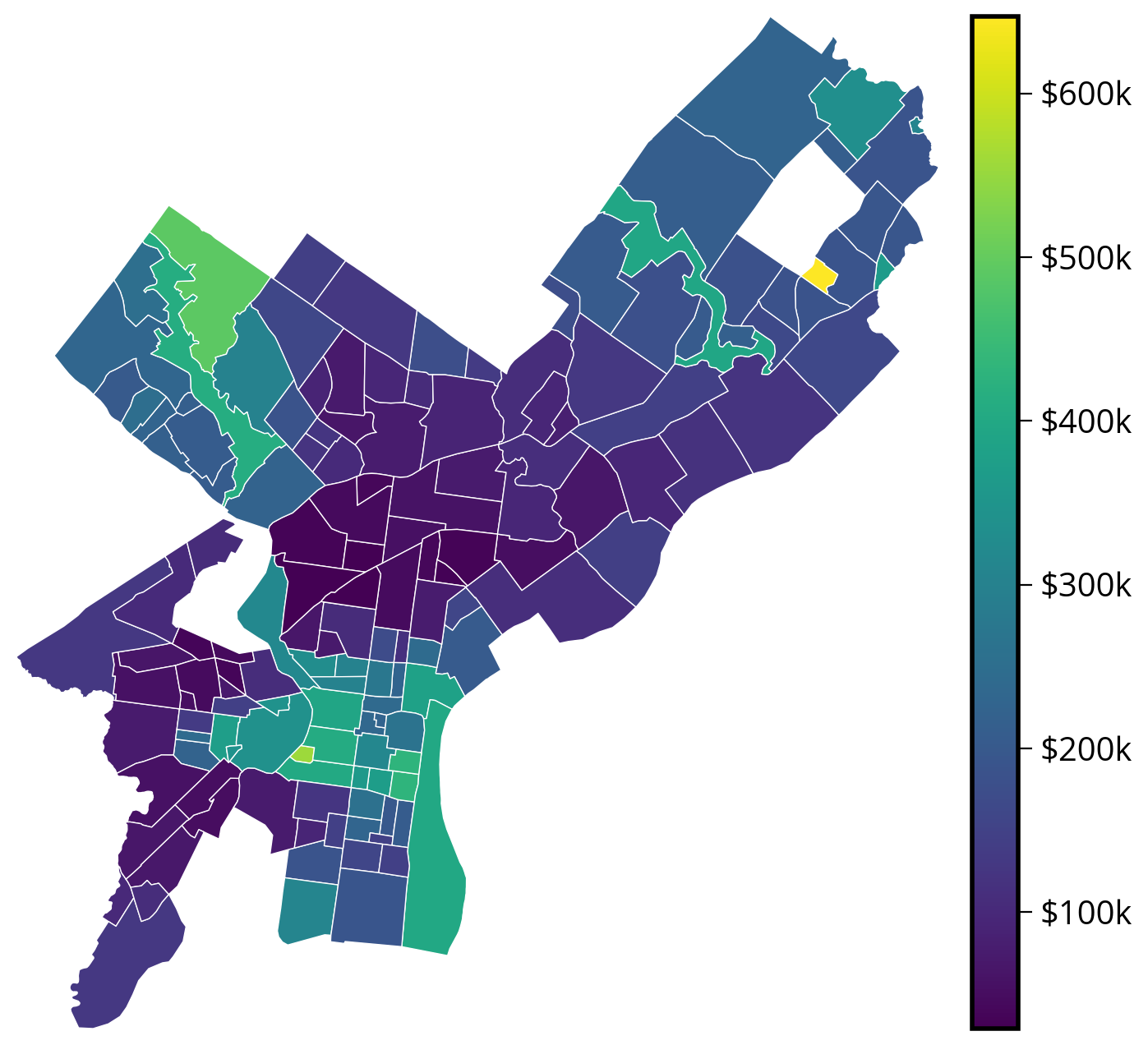
Interactive
# Via geopandas
median_values_by_hood.explore(column="market_value")
Make this Notebook Trusted to load map: File -> Trust Notebook
# Via hvplot

choro = median_values_by_hood.to_crs(epsg=3857).hvplot(
    c="market_value",
    frame_width=600,
    frame_height=600,
    alpha=0.7,
    geo=True,
    crs=3857,
    cmap="viridis",
    hover_cols=["ZillowName"],
)

gvts.EsriImagery * choro
# Via altair
# NOTE: I've projected to my desired CRS and then passed in the data
(
alt.Chart(median_values_by_hood.to_crs(epsg=2272))
.mark_geoshape(stroke="white")
.encode(
tooltip=["market_value:Q", "ZillowName:N"],
color=alt.Color("market_value:Q", scale=alt.Scale(scheme="viridis")),
)
# Important! Otherwise altair will try to re-project your data
.project(type="identity", reflectY=True)
.properties(width=500, height=500)
)Step 5: Make a hex bin map of median assessments
Make a static version with matplotlib or an interactive version with hvplot.
Remember, you will need to pass in the original, un-aggregated data to the plotting function!
Hints
For matplotlib’s hexbin() function: - You will need to use the C and reduce_C_function of the hexbin() function - Run plt.hexbin? for more help - Try testing the impact of setting bins='log' on the resulting map
For hvplot’s hexbin() function: - You will need to use the C and reduce_function of the hexbin() function - Run df.hvplot.hexbin? for more help - Try testing the impact of setting logz=True on the resulting map
Note: you should pass in the raw point data rather than any aggregated data to the hexbin() function
Static
# Convert to a projected CRS with units of meters
gdata_3857 = gdata.to_crs(epsg=3857)
# Create the axes
fig, ax = plt.subplots(figsize=(10, 8))
# Use the .x and .y attributes to get coordinates
xcoords = gdata_3857.geometry.x
ycoords = gdata_3857.geometry.y
# NOTE: we are passing in the raw point values here!
# Matplotlib is doing the binning and aggregation work for us!
hex_vals = ax.hexbin(
xcoords,
ycoords,
C=gdata_3857.market_value / 1e3, # Values to aggregate!
reduce_C_function=np.median, # Use the median function to do the aggregation in each bin
bins="log", # Use log scale for color
gridsize=30,
)
# Add the zillow geometry boundaries
# NOTE: I'm making sure it's in the same CRS as gdata_3857
zillow.to_crs(gdata_3857.crs).plot(
ax=ax, facecolor="none", edgecolor="white", linewidth=1, alpha=0.5
)
# Add a colorbar and format
cbar = fig.colorbar(hex_vals, ax=ax)
ax.set_axis_off()
ax.set_aspect("equal")
# Format cbar labels
cbar.set_ticks([100, 1000])
cbar.set_ticklabels(["$100k", "$1M"]);
Interactive
# Add them as columns
gdata_3857["x"] = gdata_3857.geometry.x
gdata_3857["y"] = gdata_3857.geometry.y
Note: this might take a minute or two!
hexbins = gdata_3857.hvplot.hexbin(
    x="x",
    y="y",
    geo=True,
    crs=3857,
    gridsize=40,
    reduce_function=np.median,  # NEW: the function to use to aggregate in each bin
    C="market_value",  # NEW: the column to aggregate in each bin
    logz=True,  # Use a log color map
    alpha=0.5,
    cmap="viridis",
    frame_width=600,
    frame_height=600,
)

# Add the imagery underneath
gvts.EsriImagery * hexbins
That’s it!
- More interactive web maps and raster datasets next week!
- See you next Monday!