# Initial imports
import matplotlib.pyplot as plt
import numpy as np
import pandas as pd
import geopandas as gpdWeek 8
Analyzing and Visualizing Large Datasets
- Oct 25, 2023
- Section 401
This week’s agenda: working with big data
By example: - Open Street Map data - Census data - NYC taxi cab trips
# Ignore numpy warnings
np.seterr("ignore");Use intake to load the dataset instructions for this week
import intakedatasets = intake.open_catalog("./datasets.yml")Import datashader and related modules:
# Datashader imports
import datashader as ds
import datashader.transfer_functions as tf# Color-related imports
from datashader.colors import Greys9, viridis, inferno
from colorcet import fireLoad the Census data to a dask array
# Load the data
# REMEMBER: this will take some time to download the first time
census_ddf = datasets.census.to_dask()census_ddfDask DataFrame Structure:
| easting | northing | race | |
|---|---|---|---|
| npartitions=36 | |||
| float32 | float32 | category[unknown] | |
| ... | ... | ... | |
| ... | ... | ... | ... |
| ... | ... | ... | |
| ... | ... | ... |
Dask Name: read-parquet, 1 graph layer
census_ddf.head()| easting | northing | race | |
|---|---|---|---|
| 0 | -12418767.0 | 3697425.00 | h |
| 1 | -12418512.0 | 3697143.50 | h |
| 2 | -12418245.0 | 3697584.50 | h |
| 3 | -12417703.0 | 3697636.75 | w |
| 4 | -12418120.0 | 3697129.25 | h |
Setup canvas parameters for USA image:
from datashader.utils import lnglat_to_meters# Sensible lat/lng coordinates for U.S. cities
# NOTE: these are in lat/lng so EPSG=4326
USA = [(-124.72, -66.95), (23.55, 50.06)]
# Get USA xlim and ylim in meters (EPSG=3857)
USA_xlim_meters, USA_ylim_meters = [list(r) for r in lnglat_to_meters(USA[0], USA[1])]# Define some a default plot width & height
plot_width = 900
plot_height = int(plot_width*7.0/12)Use a custom color scheme to map racial demographics:
color_key = {"w": "aqua", "b": "lime", "a": "red", "h": "fuchsia", "o": "yellow"}Can we learn more than just population density and race?
We can use xarray to slice the array of aggregated pixel values to examine specific aspects of the data.
Question #1: Where do African Americans live?
Use the sel() function of the xarray array
# Step 1: Setup canvas
cvs = ds.Canvas(plot_width=plot_width, plot_height=plot_height)
# Step 2: Aggregate and count race category
aggc = cvs.points(census_ddf, "easting", "northing", agg=ds.count_cat("race"))aggc<xarray.DataArray (northing: 525, easting: 900, race: 5)>
array([[[0, 0, 0, 0, 0],
[0, 0, 0, 0, 0],
[0, 0, 0, 0, 0],
...,
[0, 0, 0, 0, 0],
[0, 0, 0, 0, 0],
[0, 0, 0, 0, 0]],
[[0, 0, 0, 0, 0],
[0, 0, 0, 0, 0],
[0, 0, 0, 0, 0],
...,
[0, 0, 0, 0, 0],
[0, 0, 0, 0, 0],
[0, 0, 0, 0, 0]],
[[0, 0, 0, 0, 0],
[0, 0, 0, 0, 0],
[0, 0, 0, 0, 0],
...,
...
...,
[0, 0, 0, 0, 0],
[0, 0, 0, 0, 0],
[0, 0, 0, 0, 0]],
[[0, 0, 0, 0, 0],
[0, 0, 0, 0, 0],
[0, 0, 0, 0, 0],
...,
[0, 0, 0, 0, 0],
[0, 0, 0, 0, 0],
[0, 0, 0, 0, 0]],
[[0, 0, 0, 0, 0],
[0, 0, 0, 0, 0],
[0, 0, 0, 0, 0],
...,
[0, 0, 0, 0, 0],
[0, 0, 0, 0, 0],
[0, 0, 0, 0, 0]]], dtype=uint32)
Coordinates:
* easting (easting) float64 -1.388e+07 -1.387e+07 ... -7.464e+06 -7.457e+06
* northing (northing) float64 2.822e+06 2.828e+06 ... 6.326e+06 6.333e+06
* race (race) <U1 'a' 'b' 'h' 'o' 'w'
Attributes:
x_range: (-13884029.0, -7453303.5)
y_range: (2818291.5, 6335972.0)# NEW: Select only African Americans (where "race" column is equal to "b")
agg_b = aggc.sel(race="b")agg_b<xarray.DataArray (northing: 525, easting: 900)>
array([[0, 0, 0, ..., 0, 0, 0],
[0, 0, 0, ..., 0, 0, 0],
[0, 0, 0, ..., 0, 0, 0],
...,
[0, 0, 0, ..., 0, 0, 0],
[0, 0, 0, ..., 0, 0, 0],
[0, 0, 0, ..., 0, 0, 0]], dtype=uint32)
Coordinates:
* easting (easting) float64 -1.388e+07 -1.387e+07 ... -7.464e+06 -7.457e+06
* northing (northing) float64 2.822e+06 2.828e+06 ... 6.326e+06 6.333e+06
race <U1 'b'
Attributes:
x_range: (-13884029.0, -7453303.5)
y_range: (2818291.5, 6335972.0)# Step 3: Shade and set background
img = tf.shade(agg_b, cmap=fire, how="eq_hist")
img = tf.set_background(img, "black")
img
Question #2: How to identify diverse areas?
Goal: Select pixels where each race has a non-zero count.
aggc.sel(race=["w", "b", "a", "h"]) > 0<xarray.DataArray (northing: 525, easting: 900, race: 4)>
array([[[False, False, False, False],
[False, False, False, False],
[False, False, False, False],
...,
[False, False, False, False],
[False, False, False, False],
[False, False, False, False]],
[[False, False, False, False],
[False, False, False, False],
[False, False, False, False],
...,
[False, False, False, False],
[False, False, False, False],
[False, False, False, False]],
[[False, False, False, False],
[False, False, False, False],
[False, False, False, False],
...,
...
...,
[False, False, False, False],
[False, False, False, False],
[False, False, False, False]],
[[False, False, False, False],
[False, False, False, False],
[False, False, False, False],
...,
[False, False, False, False],
[False, False, False, False],
[False, False, False, False]],
[[False, False, False, False],
[False, False, False, False],
[False, False, False, False],
...,
[False, False, False, False],
[False, False, False, False],
[False, False, False, False]]])
Coordinates:
* easting (easting) float64 -1.388e+07 -1.387e+07 ... -7.464e+06 -7.457e+06
* northing (northing) float64 2.822e+06 2.828e+06 ... 6.326e+06 6.333e+06
* race (race) <U1 'w' 'b' 'a' 'h'(aggc.sel(race=['w', 'b', 'a', 'h']) > 0).all(dim='race')<xarray.DataArray (northing: 525, easting: 900)>
array([[False, False, False, ..., False, False, False],
[False, False, False, ..., False, False, False],
[False, False, False, ..., False, False, False],
...,
[False, False, False, ..., False, False, False],
[False, False, False, ..., False, False, False],
[False, False, False, ..., False, False, False]])
Coordinates:
* easting (easting) float64 -1.388e+07 -1.387e+07 ... -7.464e+06 -7.457e+06
* northing (northing) float64 2.822e+06 2.828e+06 ... 6.326e+06 6.333e+06# Do a "logical and" operation across the "race" dimension
# Pixels will be "True" if the pixel has a positive count for each race
diverse_selection = (aggc.sel(race=['w', 'b', 'a', 'h']) > 0).all(dim='race')
diverse_selection<xarray.DataArray (northing: 525, easting: 900)>
array([[False, False, False, ..., False, False, False],
[False, False, False, ..., False, False, False],
[False, False, False, ..., False, False, False],
...,
[False, False, False, ..., False, False, False],
[False, False, False, ..., False, False, False],
[False, False, False, ..., False, False, False]])
Coordinates:
* easting (easting) float64 -1.388e+07 -1.387e+07 ... -7.464e+06 -7.457e+06
* northing (northing) float64 2.822e+06 2.828e+06 ... 6.326e+06 6.333e+06# Select the pixel values where our diverse selection criteria is True
agg2 = aggc.where(diverse_selection).fillna(0)
# and shade using our color key
img = tf.shade(agg2, color_key=color_key)
img = tf.set_background(img,"black")
img 
Question #3: Where is African American population greater than the White population?
# Select where the "b" race dimension is greater than the "w" race dimension
selection = aggc.sel(race='b') > aggc.sel(race='w')
selection<xarray.DataArray (northing: 525, easting: 900)>
array([[False, False, False, ..., False, False, False],
[False, False, False, ..., False, False, False],
[False, False, False, ..., False, False, False],
...,
[False, False, False, ..., False, False, False],
[False, False, False, ..., False, False, False],
[False, False, False, ..., False, False, False]])
Coordinates:
* easting (easting) float64 -1.388e+07 -1.387e+07 ... -7.464e+06 -7.457e+06
* northing (northing) float64 2.822e+06 2.828e+06 ... 6.326e+06 6.333e+06# Select based on the selection criteria
agg3 = aggc.where(selection).fillna(0)
img = tf.shade(agg3, color_key=color_key)
img = tf.set_background(img, "black")
img
Now let’s make it interactive!
Let’s use hvplot
# Initialize hvplot and dask
import hvplot.pandas
import hvplot.dask # NEW: dask works with hvplot too!
import holoviews as hv
import geoviews as gv
Side note: persisting dask arrays in memory
To speed up interactive calculations, you can “persist” a dask array in memory (load the data fully into memory). You should have at least 16 GB of memory to avoid memory errors, though!
If not persisted, the data will be loaded on demand to avoid memory issues, which will slow the interactive nature of the plots down slightly.
# UNCOMMENT THIS LINE IF YOU HAVE AT LEAST 16 GB OF MEMORY
census_ddf = census_ddf.persist()census_ddfDask DataFrame Structure:
| easting | northing | race | |
|---|---|---|---|
| npartitions=36 | |||
| float32 | float32 | category[unknown] | |
| ... | ... | ... | |
| ... | ... | ... | ... |
| ... | ... | ... | |
| ... | ... | ... |
Dask Name: read-parquet, 1 graph layer
census_ddf.hvplot<hvplot.plotting.core.hvPlotTabular at 0x295bcf3a0># Plot the points
points = census_ddf.hvplot.points(
x="easting",
y="northing",
datashade=True, # NEW: tell hvplot to use datashader!
aggregator=ds.count(), # NEW: how to aggregate
cmap=fire,
geo=True,
crs=3857, # Input data is in 3857, so we need to tell hvplot
frame_width=plot_width,
frame_height=plot_height,
xlim=USA_xlim_meters, # NEW: Specify the xbounds in meters (EPSG=3857)
ylim=USA_ylim_meters, # NEW: Specify the ybounds in meters (EPSG=3857)
)
# Put a tile source behind it
bg = gv.tile_sources.CartoDark
bg * pointsNote: interactive features (panning, zooming, etc) can be slow, but the map will eventually re-load!
We can visualize color-coded race interactively as well
Similar syntax to previous examples…
# Points with categorical colormap
race_map = census_ddf.hvplot.points(
x="easting",
y="northing",
datashade=True,
c="race", # NEW: color pixels by "race" column
aggregator=ds.count_cat("race"), # NEW: specify the aggregator
cmap=color_key, # NEW: use our custom color map dictionary
crs=3857,
geo=True,
frame_width=plot_width,
frame_height=plot_height,
xlim=USA_xlim_meters,
ylim=USA_ylim_meters,
)
bg = gv.tile_sources.CartoDark
bg * race_mapUse case: exploring gerrymandering
We can easily overlay Congressional districts on our map…
# Load congressional districts and convert to EPSG=3857
districts = gpd.read_file('./data/cb_2015_us_cd114_5m').to_crs(epsg=3857)# Plot the district map
districts_map = districts.hvplot.polygons(
geo=True,
crs=3857,
line_color="white",
fill_alpha=0,
frame_width=plot_width,
frame_height=plot_height,
xlim=USA_xlim_meters,
ylim=USA_ylim_meters
)
bg * districts_map# Combine the background, race map, and districts into a single map
img = bg * race_map * districts_map
imgExample 3: NYC taxi data
12 million taxi trips from 2015…
# Load from our intake catalog
# Remember: this will take some time to download the first time!
taxi_ddf = datasets.nyc_taxi_wide.to_dask()taxi_ddfDask DataFrame Structure:
| tpep_pickup_datetime | tpep_dropoff_datetime | passenger_count | trip_distance | pickup_x | pickup_y | dropoff_x | dropoff_y | fare_amount | tip_amount | dropoff_hour | pickup_hour | |
|---|---|---|---|---|---|---|---|---|---|---|---|---|
| npartitions=1 | ||||||||||||
| datetime64[ns] | datetime64[ns] | uint8 | float32 | float32 | float32 | float32 | float32 | float32 | float32 | uint8 | uint8 | |
| ... | ... | ... | ... | ... | ... | ... | ... | ... | ... | ... | ... |
Dask Name: read-parquet, 1 graph layer
print(f"{len(taxi_ddf)} Rows")
print(f"Columns: {list(taxi_ddf.columns)}")11842094 Rows
Columns: ['tpep_pickup_datetime', 'tpep_dropoff_datetime', 'passenger_count', 'trip_distance', 'pickup_x', 'pickup_y', 'dropoff_x', 'dropoff_y', 'fare_amount', 'tip_amount', 'dropoff_hour', 'pickup_hour']taxi_ddf.head()| tpep_pickup_datetime | tpep_dropoff_datetime | passenger_count | trip_distance | pickup_x | pickup_y | dropoff_x | dropoff_y | fare_amount | tip_amount | dropoff_hour | pickup_hour | |
|---|---|---|---|---|---|---|---|---|---|---|---|---|
| 0 | 2015-01-15 19:05:39 | 2015-01-15 19:23:42 | 1 | 1.59 | -8236963.0 | 4975552.5 | -8234835.5 | 4975627.0 | 12.0 | 3.25 | 19 | 19 |
| 1 | 2015-01-10 20:33:38 | 2015-01-10 20:53:28 | 1 | 3.30 | -8237826.0 | 4971752.5 | -8237020.5 | 4976875.0 | 14.5 | 2.00 | 20 | 20 |
| 2 | 2015-01-10 20:33:38 | 2015-01-10 20:43:41 | 1 | 1.80 | -8233561.5 | 4983296.5 | -8232279.0 | 4986477.0 | 9.5 | 0.00 | 20 | 20 |
| 3 | 2015-01-10 20:33:39 | 2015-01-10 20:35:31 | 1 | 0.50 | -8238654.0 | 4970221.0 | -8238124.0 | 4971127.0 | 3.5 | 0.00 | 20 | 20 |
| 4 | 2015-01-10 20:33:39 | 2015-01-10 20:52:58 | 1 | 3.00 | -8234433.5 | 4977363.0 | -8238107.5 | 4974457.0 | 15.0 | 0.00 | 20 | 20 |
# Trim to the columns
taxi_ddf = taxi_ddf[
[
"passenger_count",
"pickup_x",
"pickup_y",
"dropoff_x",
"dropoff_y",
"dropoff_hour",
"pickup_hour",
]
]Exploring the taxi pick ups…
pickups_map = taxi_ddf.hvplot.points(
x="pickup_x",
y="pickup_y",
cmap=fire,
datashade=True,
frame_width=800,
frame_height=600,
geo=True,
crs=3857
)
gv.tile_sources.CartoDark * pickups_mapGroup by the hour column to add a slider widget:
pickups_map = taxi_ddf.hvplot.points(
x="pickup_x",
y="pickup_y",
groupby="pickup_hour",
cmap=fire,
datashade=True,
frame_width=800,
frame_height=600,
geo=True,
crs=3857
)
gv.tile_sources.CartoDark * pickups_mapComparing pickups and dropoffs
- Pixels with more pickups: shaded red
- Pixels with more dropoffs: shaded blue
# Bounds in meters for NYC (EPSG=3857)
NYC = [(-8242000,-8210000), (4965000,4990000)]
# Set a plot width and height
plot_width = int(750)
plot_height = int(plot_width//1.2)w = plot_width
h = plot_heightx_range = NYC[0]
y_range = NYC[1]# Step 1: Create the canvas
cvs = ds.Canvas(plot_width=w, plot_height=h, x_range=x_range, y_range=y_range)
# Step 2: Aggregate the pick ups
picks = cvs.points(taxi_ddf, "pickup_x", "pickup_y", ds.count("passenger_count"))
# Step 2: Aggregate the drop offs
drops = cvs.points(taxi_ddf, "dropoff_x", "dropoff_y", ds.count("passenger_count"))
# Rename to same names
drops = drops.rename({"dropoff_x": "x", "dropoff_y": "y"})
picks = picks.rename({"pickup_x": "x", "pickup_y": "y"})picks<xarray.DataArray (y: 625, x: 750)>
array([[0, 0, 0, ..., 0, 0, 0],
[0, 0, 0, ..., 0, 0, 0],
[0, 0, 0, ..., 0, 0, 0],
...,
[0, 0, 0, ..., 0, 0, 0],
[0, 0, 0, ..., 0, 0, 0],
[0, 0, 0, ..., 0, 0, 0]], dtype=uint32)
Coordinates:
* x (x) float64 -8.242e+06 -8.242e+06 ... -8.21e+06 -8.21e+06
* y (y) float64 4.965e+06 4.965e+06 4.965e+06 ... 4.99e+06 4.99e+06
Attributes:
x_range: (-8242000, -8210000)
y_range: (4965000, 4990000)drops<xarray.DataArray (y: 625, x: 750)>
array([[0, 0, 0, ..., 0, 0, 0],
[0, 0, 0, ..., 0, 0, 0],
[0, 0, 0, ..., 0, 0, 0],
...,
[0, 0, 0, ..., 0, 0, 0],
[0, 0, 0, ..., 0, 0, 0],
[0, 0, 0, ..., 0, 0, 0]], dtype=uint32)
Coordinates:
* x (x) float64 -8.242e+06 -8.242e+06 ... -8.21e+06 -8.21e+06
* y (y) float64 4.965e+06 4.965e+06 4.965e+06 ... 4.99e+06 4.99e+06
Attributes:
x_range: (-8242000, -8210000)
y_range: (4965000, 4990000)def create_merged_taxi_image(
x_range, y_range, w=plot_width, h=plot_height, how="eq_hist"
):
"""
Create a merged taxi image, showing areas with:
- More pickups than dropoffs in red
- More dropoffs than pickups in blue
"""
# Step 1: Create the canvas
cvs = ds.Canvas(plot_width=w, plot_height=h, x_range=x_range, y_range=y_range)
# Step 2: Aggregate the pick ups
picks = cvs.points(taxi_ddf, "pickup_x", "pickup_y", ds.count("passenger_count"))
# Step 2: Aggregate the drop offs
drops = cvs.points(taxi_ddf, "dropoff_x", "dropoff_y", ds.count("passenger_count"))
# Rename to same names
drops = drops.rename({"dropoff_x": "x", "dropoff_y": "y"})
picks = picks.rename({"pickup_x": "x", "pickup_y": "y"})
# Step 3: Shade
# NEW: shade pixels there are more drop offs than pick ups
# These are colored blue
more_drops = tf.shade(
drops.where(drops > picks), cmap=["darkblue", "cornflowerblue"], how=how
)
# Step 3: Shade
# NEW: shade pixels where there are more pick ups than drop offs
# These are colored red
more_picks = tf.shade(
picks.where(picks > drops), cmap=["darkred", "orangered"], how=how
)
# Step 4: Combine
# NEW: add the images together!
img = tf.stack(more_picks, more_drops)
return tf.set_background(img, "black")create_merged_taxi_image(NYC[0], NYC[1])
Takeaway: pickups occur more often on major roads, and dropoffs on smaller roads
Let’s generate a time-lapse GIF of drop-offs over time
Powerful tool for visualizing trends over time
Define some functions…
Important: We can convert our datashaded images to the format of the Python Imaging Library (PIL) to visualize
def create_taxi_image(df, x_range, y_range, w=plot_width, h=plot_height, cmap=fire):
"""Create an image of taxi dropoffs, returning a Python Imaging Library (PIL) image."""
# Step 1: Create the canvas
cvs = ds.Canvas(plot_width=w, plot_height=h, x_range=x_range, y_range=y_range)
# Step 2: Aggregate the dropoff positions, coutning number of passengers
agg = cvs.points(df, 'dropoff_x', 'dropoff_y', ds.count('passenger_count'))
# Step 3: Shade
img = tf.shade(agg, cmap=cmap, how='eq_hist')
# Set the background
img = tf.set_background(img, "black")
# NEW: return an PIL image
return img.to_pil()def convert_to_12hour(hr24):
"""Convert from 24 hr to 12 hr."""
from datetime import datetime
d = datetime.strptime(str(hr24), "%H")
return d.strftime("%I %p")def plot_dropoffs_by_hour(fig, data_all_hours, hour, x_range, y_range):
"""Plot the dropoffs for particular hour."""
# Trim to the specific hour
df_this_hour = data_all_hours.loc[data_all_hours["dropoff_hour"] == hour]
# Create the datashaded image for this hour
img = create_taxi_image(df_this_hour, x_range, y_range)
# Plot the image on a matplotlib axes
# Use imshow()
plt.clf()
ax = fig.gca()
ax.imshow(img, extent=[x_range[0], x_range[1], y_range[0], y_range[1]])
# Format the axis and figure
ax.set_aspect("equal")
ax.set_axis_off()
fig.subplots_adjust(left=0, right=1, top=1, bottom=0)
# Optional: Add a text label for the hour
ax.text(
0.05,
0.9,
convert_to_12hour(hour),
color="white",
fontsize=40,
ha="left",
transform=ax.transAxes,
)
# Draw the figure and return the image
# This converts our matplotlib Figure into a format readable by imageio
fig.canvas.draw()
image = np.frombuffer(fig.canvas.tostring_rgb(), dtype="uint8")
image = image.reshape(fig.canvas.get_width_height()[::-1] + (3,))
return imageStrategy:
- Create a datashaded image for each hour of taxi dropoffs, return as a PIL image object
- Use matplotlib’s
imshow()to plot each datashaded image to a matplotlib Figure - Return each matplotlib Figure in a format readable by the
imageiolibrary - Combine all of our images for each hours into a GIF using the
imageiolibrary
import imageio# Create a figure
fig, ax = plt.subplots(figsize=(10, 10), facecolor="black")
# Create an image for each hour
imgs = []
for hour in range(24):
# Plot the datashaded image for this specific hour
print(hour)
img = plot_dropoffs_by_hour(fig, taxi_ddf, hour, x_range=NYC[0], y_range=NYC[1])
imgs.append(img)
# Combing the images for each hour into a single GIF
imageio.mimsave("dropoffs.gif", imgs, duration=1000);0
1
2
3
4
5
6
7
8
9
10
11
12
13
14
15
16
17
18
19
20
21
22
23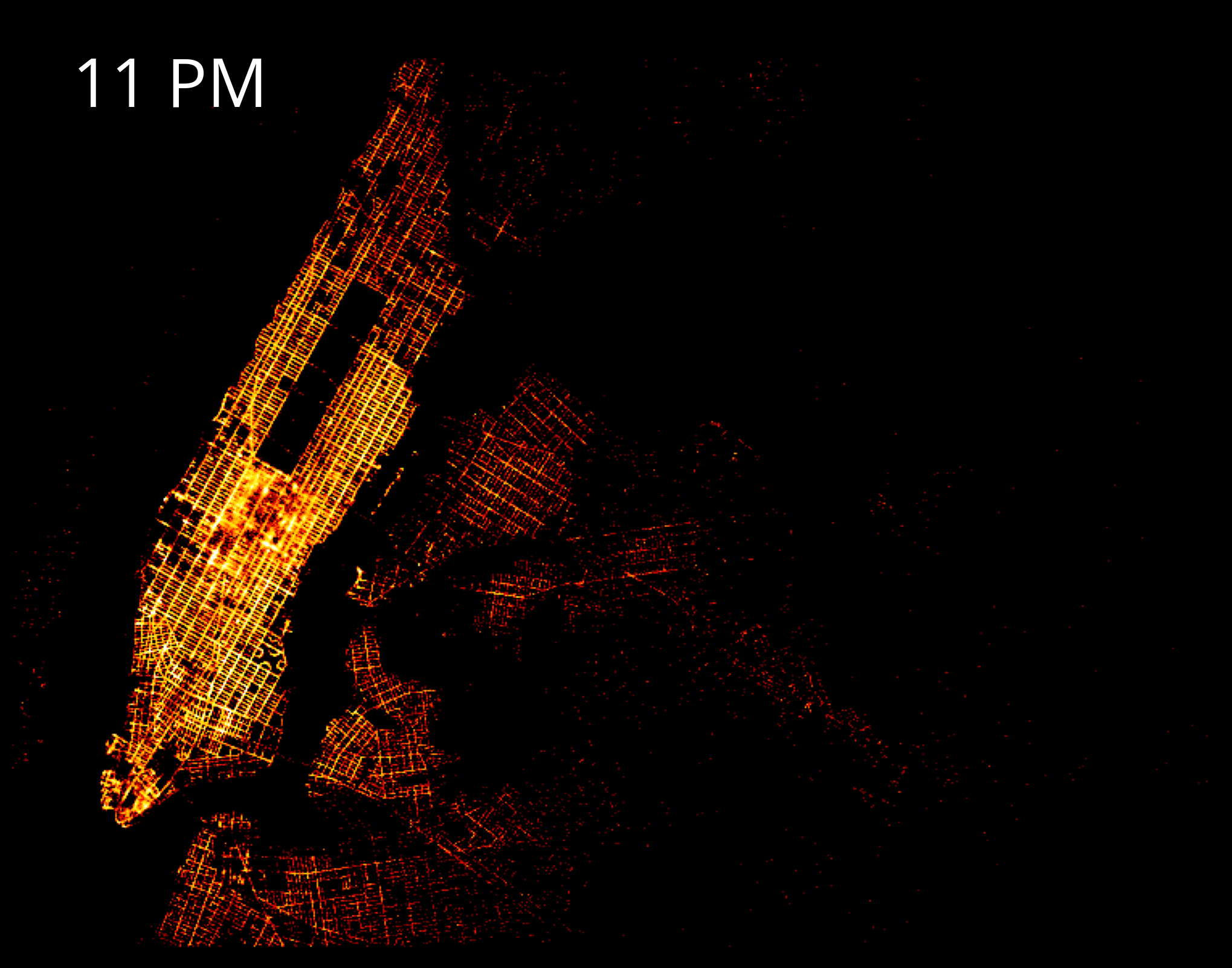
Interesting aside: Beyond hvplot
Analyzing hourly and weekly trends for taxis using holoviews
- We’ll load taxi data from 2016 that includes the number of pickups per hour.
- Visualize weekly and hourly trends using a radial heatmap
df = pd.read_csv('./data/nyc_taxi_2016_by_hour.csv.gz', parse_dates=['Pickup_date'])df.head()| Pickup_date | Pickup_Count | |
|---|---|---|
| 0 | 2016-01-01 00:00:00 | 19865 |
| 1 | 2016-01-01 01:00:00 | 24376 |
| 2 | 2016-01-01 02:00:00 | 24177 |
| 3 | 2016-01-01 03:00:00 | 21538 |
| 4 | 2016-01-01 04:00:00 | 15665 |
Let’s plot a radial heatmap
The binning dimensions of the heat map will be:
- Day of Week and Hour of Day
- Week of Year
A radial heatmap can be read similar to tree rings:
- The center of the heatmap will represent the first week of the year, while the outer edge is the last week of the year
- Rotating clockwise along a specific ring tells you the day/hour.
# Create a Holoviews HeatMap option
cols = ["Day & Hour", "Week of Year", "Pickup_Count", "Date"]
heatmap = hv.HeatMap(
df[cols], kdims=["Day & Hour", "Week of Year"], vdims=["Pickup_Count", "Date"]
)heatmap.opts(
radial=True,
height=600,
width=600,
yticks=None,
xmarks=7,
ymarks=3,
start_angle=np.pi * 19 / 14,
xticks=(
"Friday",
"Saturday",
"Sunday",
"Monday",
"Tuesday",
"Wednesday",
"Thursday",
),
tools=["hover"],
cmap="fire"
)Trends
- Taxi pickup counts are high between 7-9am and 5-10pm during weekdays which business hours as expected. In contrast, during weekends, there is not much going on until 11am.
- Friday and Saterday nights clearly stand out with the highest pickup densities as expected.
- Public holidays can be easily identified. For example, taxi pickup counts are comparetively low around Christmas and Thanksgiving.
- Weather phenomena also influence taxi service. There is a very dark stripe at the beginning of the year starting at Saturday 23rd and lasting until Sunday 24th. Interestingly, there was one of the biggest blizzards in the history of NYC.
Useful reference: the Holoviews example gallery
This radial heatmap example, and many more examples beyond hvplot available:
Exercise: Datashading Philly parking violations data
Download the data
- A (large) CSV of parking violation data is available for download at: https://musa550.s3.amazonaws.com/parking_violations.csv
- Navigate to your browser, plug in the above URL, and download the data
- The data is from Open Data Philly: https://www.opendataphilly.org/dataset/parking-violations
- Input data is in EPSG=4326
- Remember: You will need to convert latitude/longitude to Web Mercator (epsg=3857) to work with datashader.
Step 1: Use dask to load the data
- The
dask.dataframemodule includes aread_csv()function just like pandas - You’ll want to specify the
assume_missing=Truekeyword for that function: that will let dask know that some columns are allowed to have missing values
import dask.dataframe as dd# I downloaded the data and moved it to the "data/" folder
df = dd.read_csv("data/parking_violations.csv", assume_missing=True)dfDask DataFrame Structure:
| lon | lat | |
|---|---|---|
| npartitions=4 | ||
| float64 | float64 | |
| ... | ... | |
| ... | ... | |
| ... | ... | |
| ... | ... |
Dask Name: read-csv, 1 graph layer
len(df)9412858df.head()| lon | lat | |
|---|---|---|
| 0 | -75.158937 | 39.956252 |
| 1 | -75.154730 | 39.955233 |
| 2 | -75.172386 | 40.034175 |
| 3 | NaN | NaN |
| 4 | -75.157291 | 39.952661 |
Step 2: Remove any rows with missing geometries
Remove rows that have NaN for either the lat or lon columns (hint: use the dropna() function!)
df = df.dropna()dfDask DataFrame Structure:
| lon | lat | |
|---|---|---|
| npartitions=4 | ||
| float64 | float64 | |
| ... | ... | |
| ... | ... | |
| ... | ... | |
| ... | ... |
Dask Name: dropna, 2 graph layers
len(df)8659655Step 3: Convert lat/lng to Web Mercator coordinates (x, y)
Add two new columns, x and y, that represent the coordinates in the EPSG=3857 CRS.
Hint: Use datashader’s lnglat_to_meters() function.
from datashader.utils import lnglat_to_meters# Do the conversion
x, y = lnglat_to_meters(df['lon'], df['lat'])# Add as columns
df['x'] = x
df['y'] = ydf.head()| lon | lat | x | y | |
|---|---|---|---|---|
| 0 | -75.158937 | 39.956252 | -8.366655e+06 | 4.859587e+06 |
| 1 | -75.154730 | 39.955233 | -8.366186e+06 | 4.859439e+06 |
| 2 | -75.172386 | 40.034175 | -8.368152e+06 | 4.870910e+06 |
| 4 | -75.157291 | 39.952661 | -8.366471e+06 | 4.859066e+06 |
| 5 | -75.162902 | 39.959713 | -8.367096e+06 | 4.860090e+06 |
dfDask DataFrame Structure:
| lon | lat | x | y | |
|---|---|---|---|---|
| npartitions=4 | ||||
| float64 | float64 | float64 | float64 | |
| ... | ... | ... | ... | |
| ... | ... | ... | ... | |
| ... | ... | ... | ... | |
| ... | ... | ... | ... |
Dask Name: assign, 15 graph layers
Step 4: Get the x/y range for Philadelphia for our canvas
- Convert the lat/lng bounding box into Web Mercator EPSG=3857
- Use the
lnglat_to_meters()function to do the conversion - You should have two variables
x_rangeandy_rangethat give you the correspondingxandybounds
# Use lat/lng bounds for Philly
# This will exclude any points that fall outside this region
PhillyBounds = [( -75.28, -74.96), (39.86, 40.14)]PhillyBoundsLng = PhillyBounds[0]
PhillyBoundsLat = PhillyBounds[1]# Convert to an EPSG=3857
x_range, y_range = lnglat_to_meters(PhillyBoundsLng, PhillyBoundsLat)
x_rangearray([-8380131.26691764, -8344509.02986379])# Optional: convert to lists as opposed to arrays
x_range = list(x_range)
y_range = list(y_range)x_range[-8380131.266917636, -8344509.029863787]Step 5: Datashade the dataset
Create a matplotlib figure with the datashaded image of the parking violation dataset.
# STEP 1: Create the canvas
cvs = ds.Canvas(plot_width=600, plot_height=600, x_range=x_range, y_range=y_range)
# STEP 2: Aggregate the points
agg = cvs.points(df, "x", "y", agg=ds.count())
# STEP 3: Shade the aggregated pixels
img = tf.shade(agg, cmap=fire, how="eq_hist")
# Optional: Set the background of the image
img = tf.set_background(img, "black")
# Show!
img
type(img)datashader.transfer_functions.ImageLet’s add the city limits.
You’ll need to convert your datashaded image to PIL format and use the imshow() function.
# Load
city_limits = gpd.read_file("./data/City_Limits.geojson")
# Same CRS!
city_limits = city_limits.to_crs(epsg=3857)# Show with matplotlib
fig, ax = plt.subplots(figsize=(10, 10))
# NEW:
ax.imshow(img.to_pil(), extent=[x_range[0], x_range[1], y_range[0], y_range[1]])
# Format
ax.set_aspect("equal")
ax.set_axis_off()
# Add the city limits on top!
city_limits.plot(ax=ax, facecolor="none", edgecolor="white", linewidth=2)<Axes: >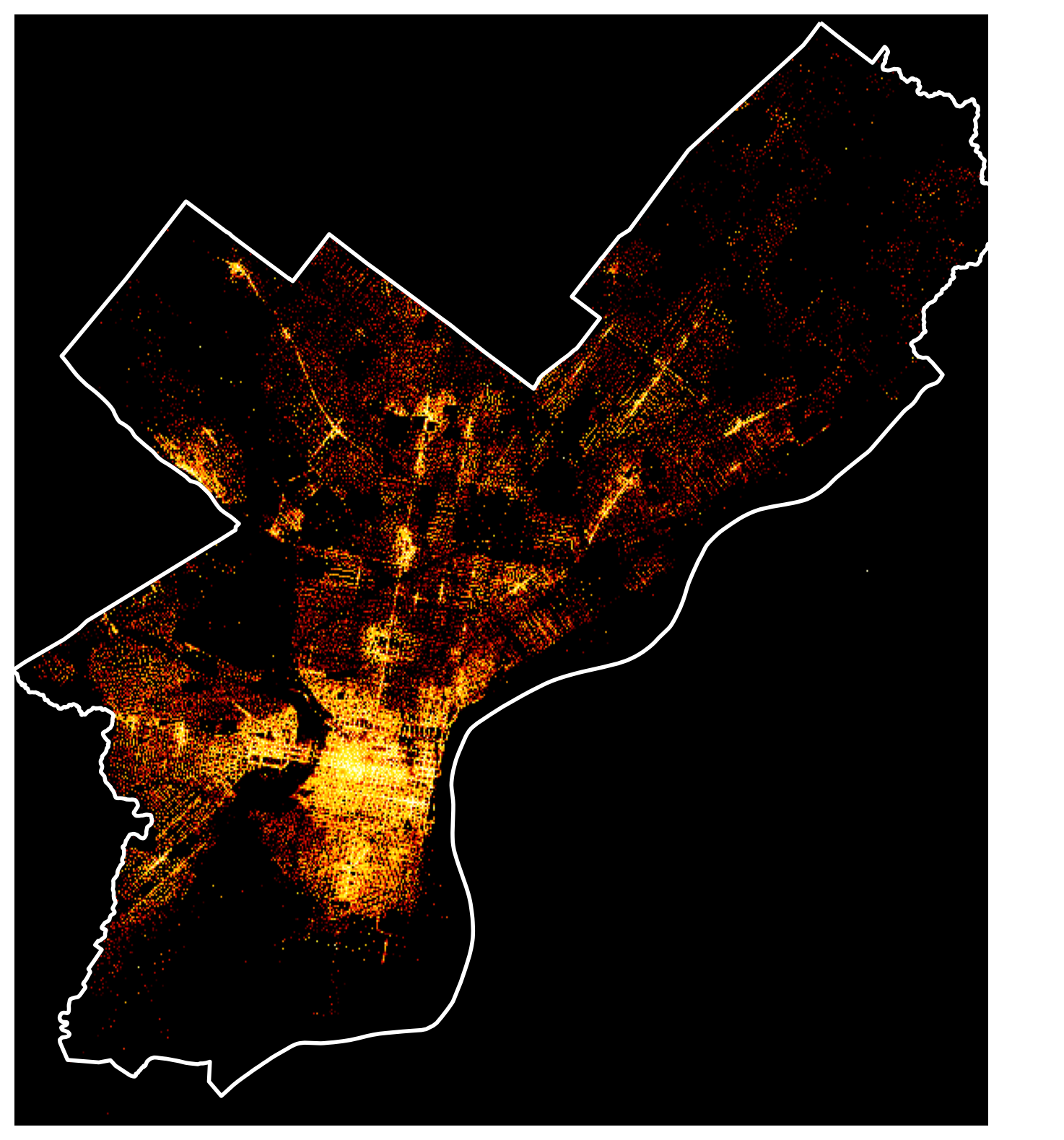
Step 6: Make an interactive map
Use hvplot to make an interactive version of your datashaded image.
violations = df.hvplot.points(
x="x",
y="y",
datashade=True,
geo=True,
crs=3857,
frame_width=600,
frame_height=600,
cmap=fire,
xlim=x_range,
ylim=y_range,
)
gv.tile_sources.CartoDark * violationsThat’s it!
- Next week: dashboards and presenting your results on the web!
- See you on Monday!