import warnings
warnings.filterwarnings("ignore")
#warnings.filterwarnings("default")
import logging
logging.getLogger('numba.core.byteflow').setLevel(logging.WARNING)
logging.getLogger("fsspec").setLevel(logging.WARNING)Part 1 - Global Cell Tower Insights: Mapping, Networks, and Country Metrics
# Data analysis
import geopandas as gpd
import numpy as np
import pandas as pd
import intake
import dask
from shapely.geometry import Point
# Plotting
import seaborn as sns
from matplotlib import pyplot as plt
import altair as alt
import holoviews as hv
import hvplot.pandas
import geoviews as gv
import geoviews.tile_sources as gvts
import datashader as ds
import datashader.transfer_functions as tf
from datashader.colors import Greys9, viridis, inferno
from colorcet import fire, kgy, CET_CBL3
# Sci-Kit Learn
from sklearn.preprocessing import StandardScaler, MinMaxScaler, RobustScaler
from sklearn.cluster import KMeans
pd.options.display.max_columns = 999Global Tower Topography: Visualizing The Networks Of Cell Connectivity
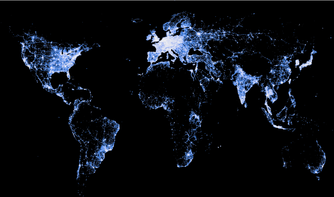
First and foremost, we start with visualizing cell tower coverage across the world. The OpenCellID database has a dataframe with over 200 million observations of cell towers, which we aggregate and plot using Intake, Dask, and Datashader - parallel computing and data loading plugins for Python. We observe regions with high concentrations of cell towers located primarily in the United States, most of Europe, Japan, and South Korea. We notice dark spots in Central Africa, South America, West Asia, and rural China. The high concentration of cell towers in certain regions reflects not only technological advancement but also economic and urban development. Conversely, the observable gaps in Central Africa, South America, West Asia, and rural China hint at the challenges and disparities in extending telecommunication infrastructure to more remote and less economically developed regions. This understanding of cell tower distribution highlights the interconnectedness of technology, geography, and socio-economic factors on a global scale.
ctw = intake.open_csv('./Data/cell_towers.csv')
ddf = ctw.to_dask()max_lon = ddf['lon'].max().compute()
min_lon = ddf['lon'].min().compute()
max_lat = ddf['lat'].max().compute()
min_lat = ddf['lat'].min().compute()
print(f"Max Longitude: {max_lon}, Min Longitude: {min_lon}")
print(f"Max Latitude: {max_lat}, Min Latitude: {min_lat}")Max Longitude: 179.9732208252, Min Longitude: -179.9732208252
Max Latitude: 78.334579467773, Min Latitude: -54.936431global_x_range = (-179.9732208252, 179.9732208252)
global_y_range = (-54.936431, 78.334579467773)
# Default width and height
global_plot_width = 900
global_plot_height = int(global_plot_width*0.5)canvas = ds.Canvas(
plot_width=global_plot_width,
plot_height=global_plot_height,
x_range=global_x_range,
y_range=global_y_range,
)agg = canvas.points(ddf, "lon", "lat", agg=ds.count())
selected = agg.where(agg > 15)
tf.set_background(tf.shade(selected, cmap=CET_CBL3),"black")Next, we can take a closer look at the differences across global cell networks based on the radio system type. This can help us understand the difference in advancement of ICT across different countries. These radio systems are commonly recognized for their roles in supporting mobile networks categorized as “2G,” “3G,” or “4G.” According to the article titled “Difference Between Cellular Technologies: GSM, CDMA, UMTS, and LTE” by Wilson Amplifiers:
- GSM is the standard radio system supporting 2G network
- CDMA is a competitor to GSM also supporting 2G network
- UMTS of the GSM network supports 3G network
- LTE migrates CDMA/CDMA2000 and GSM/UMTS into the 4G network
- NR is a “New Radio” technology supporting 5G network
In this visualization, one can observe that a significant number of global cell towers employ the UMTS radio system, providing support for 3G mobile data. Additionally, specific concentrations of LTE are evident in regions such as the United States, India, East Asia, and Europe.
ddf['radio'] = ddf['radio'].astype('category')
color_key = {"GSM": "#707390",
"CDMA": "#93b7be",
"UMTS": "#e0ca3c",
"LTE": "#b59ab8",
"NR": "#048a81"}agg = canvas.points(ddf, "lon", "lat", agg=ds.count_cat("radio"))
selected = agg.where(agg > 15)
tf.set_background(tf.shade(selected, color_key=color_key),"black")legend_df = pd.DataFrame(list(color_key.items()), columns=["radio", "color"])
legend = (alt.Chart(legend_df)
.mark_rect(stroke="black", strokeWidth=1)
.encode(
y=alt.Y("radio:N", axis=alt.Axis(title=""), sort=alt.SortField("index")),
color=alt.Color("color:N", legend=None, scale=None),
# tooltip=["radio", "color"]
)
.properties(width=100, height=120, title="Radio Systems Guide"))
legendDominant Types of Global Cell Tower Technologies
Considering the variations in cell tower types, let’s explore the differences in alignment with the country metrics - population and per capita GDP. This analysis aims to examine the correlation between cell tower coverage, type, and the developmental status of countries. In addition to using data from OpenCellID, we incorporate information from the World Bank. The determination of a ‘dominant cell type’ for each country is based on the most prevalent type of cell tower within that nation. Unfortunately, there is no available data on NR (new radio, 5G). The following map depicts the most prevalent cell tower type in each country, providing insight into the technological advancement of their cell tower infrastructure. Noteworthy findings include China, the United States, Norway, Australia, and Japan leading with 4G LTE technology. It’s also important to note that not all countries have sufficient data and thus, excluded from our analysis.
gdp_per_capita = pd.read_csv("./Data/gdp_per_capita.csv") #data from world bank
gdp_per_capita = gdp_per_capita[['Country Name', '2021 [YR2021]']]
gdp_per_capita = gdp_per_capita.rename(columns={
'Country Name': 'country',
'2021 [YR2021]': 'gdp_per_capita'
})
gdp_per_capita = gdp_per_capita.dropna(subset=['country'])
population = pd.read_csv("./data/population.csv") #data from world bank
population = population[['Country Name', '2021 [YR2021]']]
population = population.rename(columns={
'Country Name': 'country',
'2021 [YR2021]': 'population'
})
population = population.dropna(subset=['country'])
gpc_pop = population.merge(gdp_per_capita, how='left', on='country')countries = gpd.read_file("https://datahub.io/core/geo-countries/r/countries.geojson")
countries = countries[['ADMIN', 'geometry']]
countries = countries.rename(columns={'ADMIN': 'country'})gpc_pop_countries = countries.merge(gpc_pop, how='left', on='country')countries_towers = pd.read_csv("./Data/international_cell_towers.csv")merge = countries_towers.merge(gpc_pop_countries, how='left', on='country')
merge.rename(columns={'UMES': 'UMTS'}, inplace=True)tower_types = ['UMTS', 'GSM', 'LTE', 'CDMA']
merge['dominant_tower_type'] = merge[tower_types].idxmax(axis=1)merge['cell_towers'] = pd.to_numeric(merge['cell_towers'], errors='coerce')
merge['population'] = pd.to_numeric(merge['population'], errors='coerce')
merge['gdp_per_capita'] = pd.to_numeric(merge['gdp_per_capita'], errors='coerce')
merge['ctw_per_capita'] = merge['cell_towers'] / merge['population']
merge = gpd.GeoDataFrame(merge, geometry='geometry')
merge = merge.dropna(subset=['geometry'])
merge = merge.to_crs('EPSG:3857')%%opts WMTS [width=global_plot_width, height=global_plot_height, xaxis=None, yaxis=None]
choro = merge.hvplot(
c="dominant_tower_type",
frame_width=600,
frame_height=600,
alpha=0.5,
geo=True,
crs='EPSG:3857',
cmap="kgy",
hover_cols=["country"],
geometry='geometry',
)
gvts.EsriImagery * choroWARNING:param.main: geometry option not found for polygons plot; similar options include: []