import pandas as pd
from matplotlib import pyplot as plt
import seaborn as snsShowing static visualizations
This page is generated from a Jupyter notebook and demonstrates how to generate static visualizations with matplotlib, pandas, and seaborn.
Start by importing the packages we need:
Load the “Palmer penguins” dataset from week 2:
# Load data on Palmer penguins
penguins = pd.read_csv("https://raw.githubusercontent.com/MUSA-550-Fall-2023/week-2/main/data/penguins.csv")
# Show the first ten rows
penguins.head(n=10) | species | island | bill_length_mm | bill_depth_mm | flipper_length_mm | body_mass_g | sex | year | |
|---|---|---|---|---|---|---|---|---|
| 0 | Adelie | Torgersen | 39.1 | 18.7 | 181.0 | 3750.0 | male | 2007 |
| 1 | Adelie | Torgersen | 39.5 | 17.4 | 186.0 | 3800.0 | female | 2007 |
| 2 | Adelie | Torgersen | 40.3 | 18.0 | 195.0 | 3250.0 | female | 2007 |
| 3 | Adelie | Torgersen | NaN | NaN | NaN | NaN | NaN | 2007 |
| 4 | Adelie | Torgersen | 36.7 | 19.3 | 193.0 | 3450.0 | female | 2007 |
| 5 | Adelie | Torgersen | 39.3 | 20.6 | 190.0 | 3650.0 | male | 2007 |
| 6 | Adelie | Torgersen | 38.9 | 17.8 | 181.0 | 3625.0 | female | 2007 |
| 7 | Adelie | Torgersen | 39.2 | 19.6 | 195.0 | 4675.0 | male | 2007 |
| 8 | Adelie | Torgersen | 34.1 | 18.1 | 193.0 | 3475.0 | NaN | 2007 |
| 9 | Adelie | Torgersen | 42.0 | 20.2 | 190.0 | 4250.0 | NaN | 2007 |
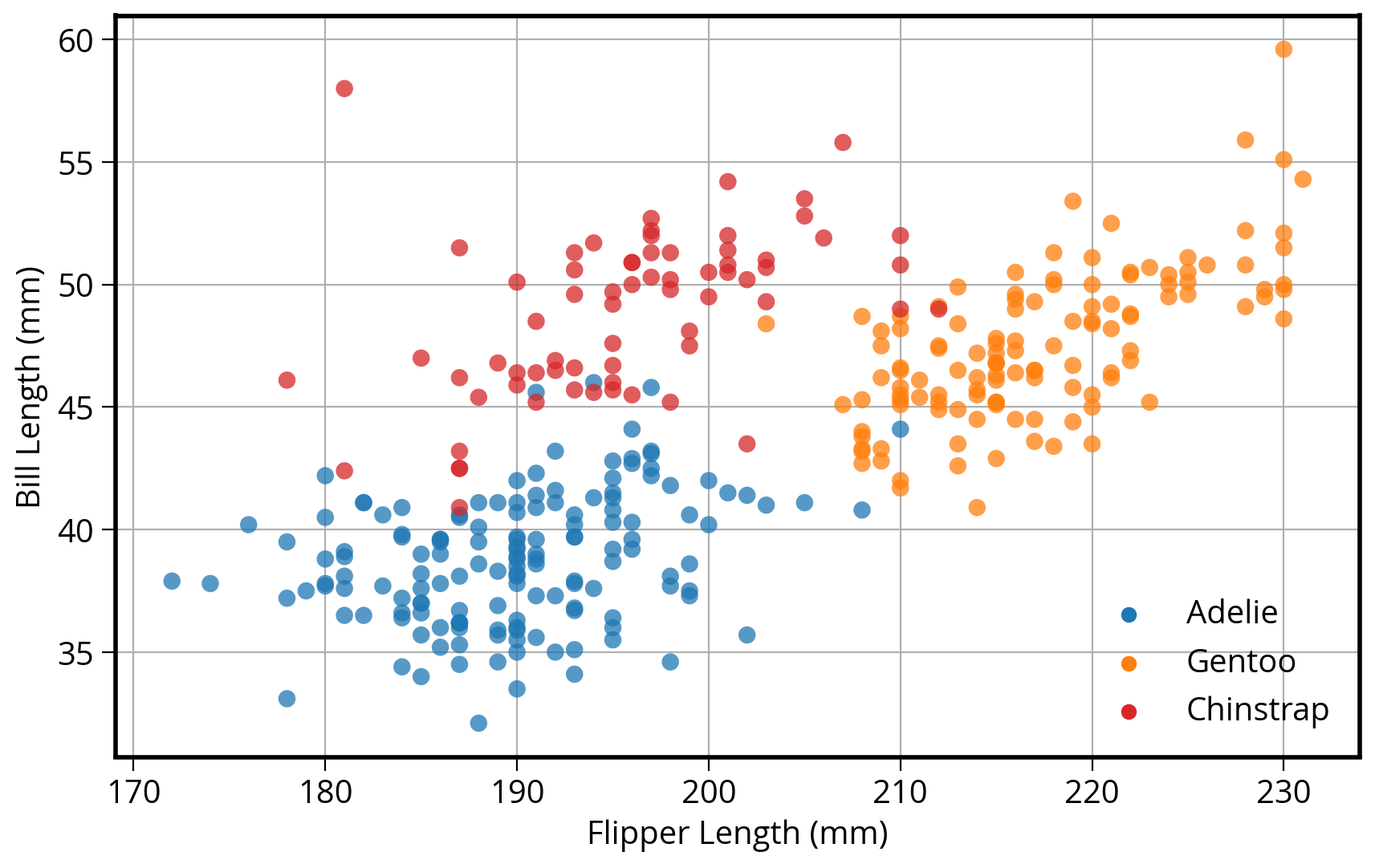
A simple visualization, 3 different ways
I want to scatter flipper length vs. bill length, colored by the penguin species
Using matplotlib
# Setup a dict to hold colors for each species
color_map = {"Adelie": "#1f77b4", "Gentoo": "#ff7f0e", "Chinstrap": "#D62728"}

# Initialize the figure "fig" and axes "ax"
fig, ax = plt.subplots(figsize=(10, 6))

# Group the data frame by species and loop over each group
# NOTE: "group" will be the dataframe holding the data for "species"
for species, group_df in penguins.groupby("species"):

    # Plot flipper length vs bill length for this group
    # Note: we are adding this plot to the existing "ax" object
    ax.scatter(
        group_df["flipper_length_mm"],
        group_df["bill_length_mm"],
        marker="o",
        label=species,
        color=color_map[species],
        alpha=0.75,
        zorder=10
    )

# Plotting is done...format the axes!

## Add a legend to the axes
ax.legend(loc="best")

## Add x-axis and y-axis labels
ax.set_xlabel("Flipper Length (mm)")
ax.set_ylabel("Bill Length (mm)")

## Add the grid of lines
ax.grid(True);
How about in pandas?
DataFrames have a built-in “plot” function that can make all of the basic type of matplotlib plots!
First, we need to add a new “color” column specifying the color to use for each species type.
Use the pd.replace() function: it use a dict to replace values in a DataFrame column.
# Calculate a list of colors
color_map = {"Adelie": "#1f77b4", "Gentoo": "#ff7f0e", "Chinstrap": "#D62728"}

# Map species name to color
penguins["color"] = penguins["species"].replace(color_map)

penguins.head()| species | island | bill_length_mm | bill_depth_mm | flipper_length_mm | body_mass_g | sex | year | color | |
|---|---|---|---|---|---|---|---|---|---|
| 0 | Adelie | Torgersen | 39.1 | 18.7 | 181.0 | 3750.0 | male | 2007 | #1f77b4 |
| 1 | Adelie | Torgersen | 39.5 | 17.4 | 186.0 | 3800.0 | female | 2007 | #1f77b4 |
| 2 | Adelie | Torgersen | 40.3 | 18.0 | 195.0 | 3250.0 | female | 2007 | #1f77b4 |
| 3 | Adelie | Torgersen | NaN | NaN | NaN | NaN | NaN | 2007 | #1f77b4 |
| 4 | Adelie | Torgersen | 36.7 | 19.3 | 193.0 | 3450.0 | female | 2007 | #1f77b4 |
Now plot!
# Same as before: Start by initializing the figure and axes
fig, myAxes = plt.subplots(figsize=(10, 6))

# Scatter plot two columns, colored by third
# Use the built-in pandas plot.scatter function
penguins.plot.scatter(
    x="flipper_length_mm",
    y="bill_length_mm",
    c="color",
    alpha=0.75,
    ax=myAxes, # IMPORTANT: Make sure to plot on the axes object we created already!
    zorder=10
)

# Format the axes finally
myAxes.set_xlabel("Flipper Length (mm)")
myAxes.set_ylabel("Bill Length (mm)")
myAxes.grid(True);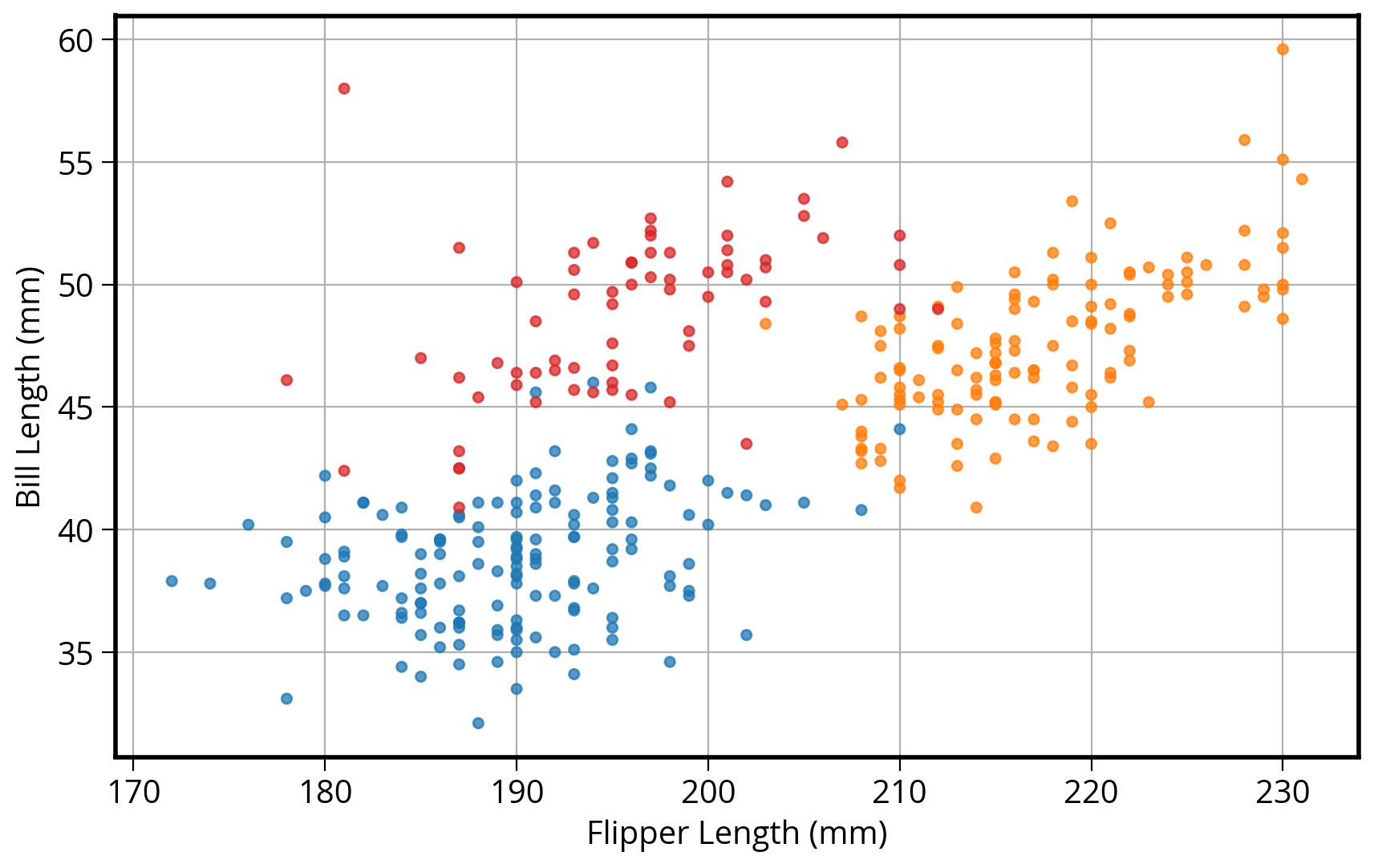
Note: no easy way to get legend added to the plot in this case…
Seaborn: statistical data visualization
Seaborn is designed to plot two columns colored by a third column…
# Initialize the figure and axes
fig, ax = plt.subplots(figsize=(10, 6))

# style keywords as dict
color_map = {"Adelie": "#1f77b4", "Gentoo": "#ff7f0e", "Chinstrap": "#D62728"}
style = dict(palette=color_map, s=60, edgecolor="none", alpha=0.75, zorder=10)

# use the scatterplot() function
sns.scatterplot(
    x="flipper_length_mm",  # the x column
    y="bill_length_mm",  # the y column
    hue="species",  # the third dimension (color)
    data=penguins,  # pass in the data
    ax=ax,  # plot on the axes object we made
    **style  # add our style keywords
)

# Format with matplotlib commands
ax.set_xlabel("Flipper Length (mm)")
ax.set_ylabel("Bill Length (mm)")
ax.grid(True)
ax.legend(loc="best");